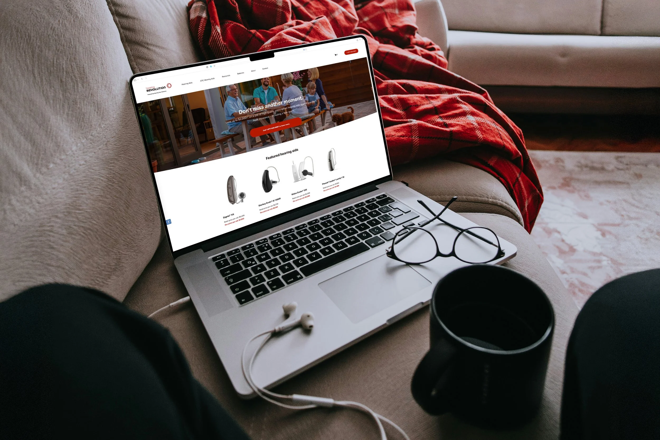
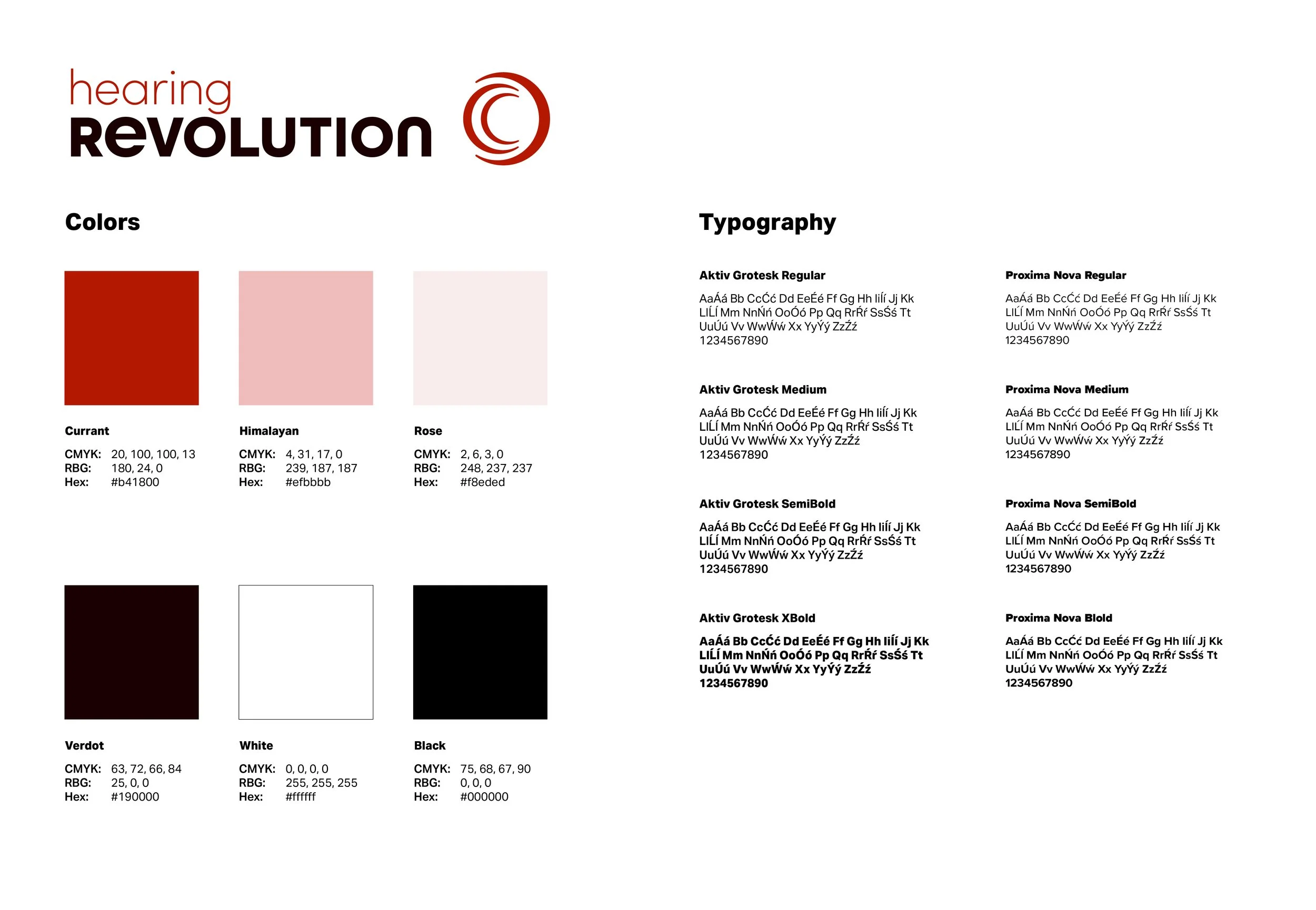
Hearing Revolution
Hearing Revolution: “Best quality hearing aids at the most reasonable price available.” The logo concept was inspired by the sound waves produced by hearing and the way they are perceived by the human ear. Through the use of color and typography, the design aims to communicate a sense of innovation and transformation, reflecting the brand’s commitment to delivering high-quality hearing solutions that remain affordable.
The project including the branding identity was made in collaboration with Senior Graphic designer Ryan Hruska Jr, and completed while employed at Hearing Care Solutions.