PORTFOLIO
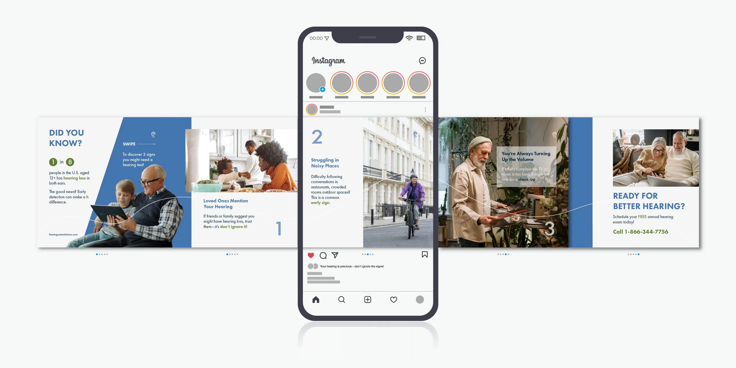
Hearing Care Solutions
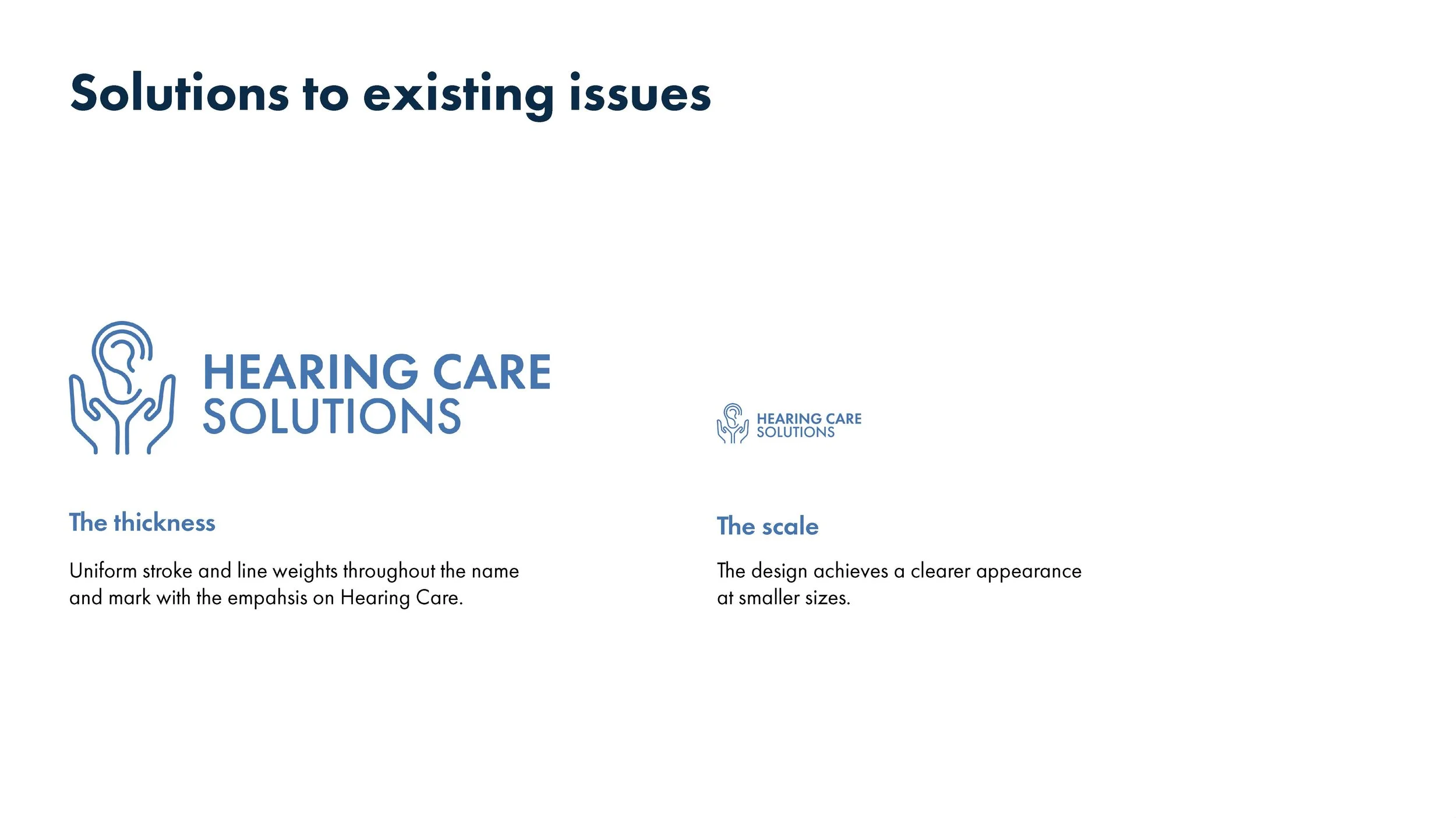
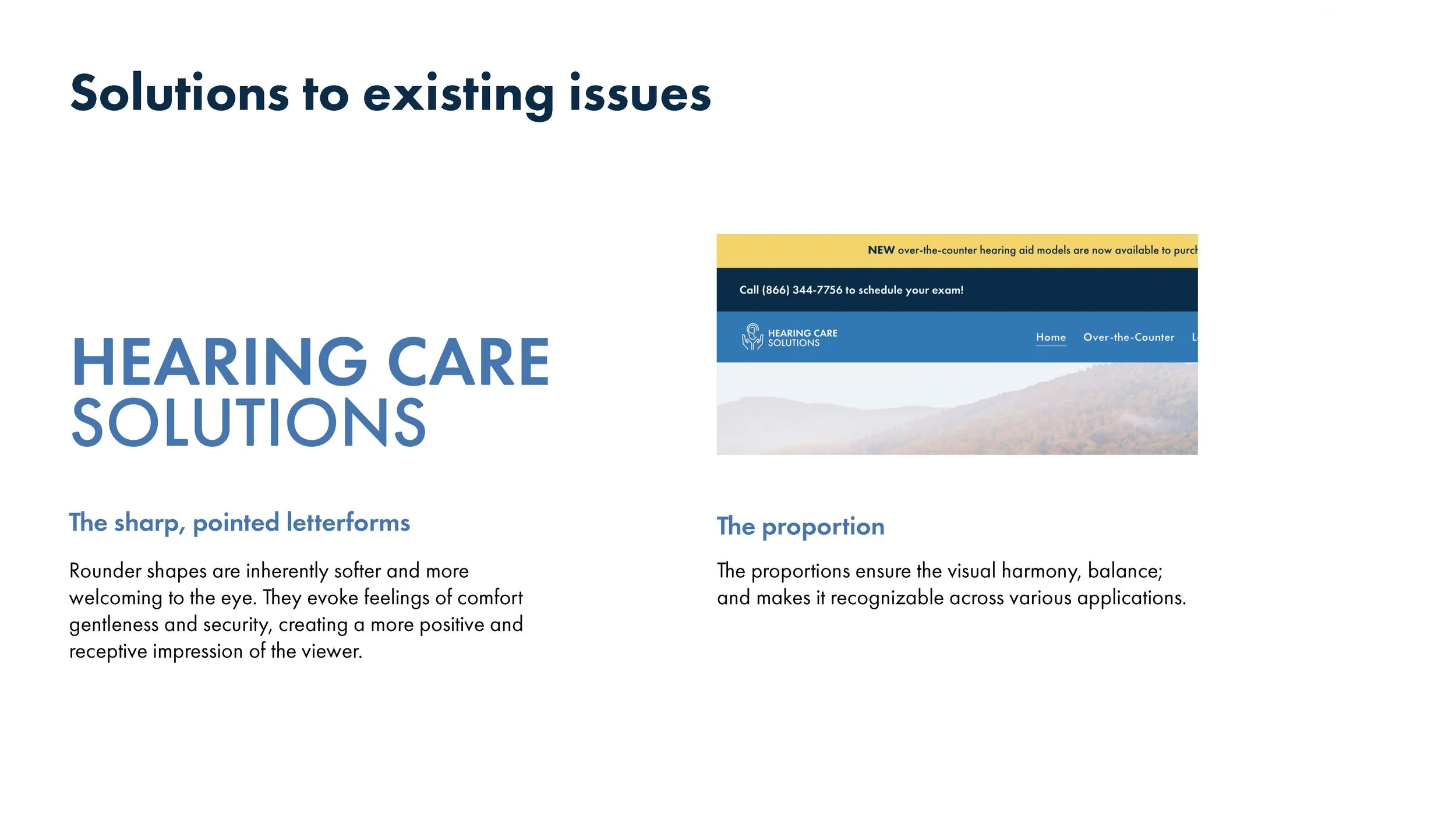
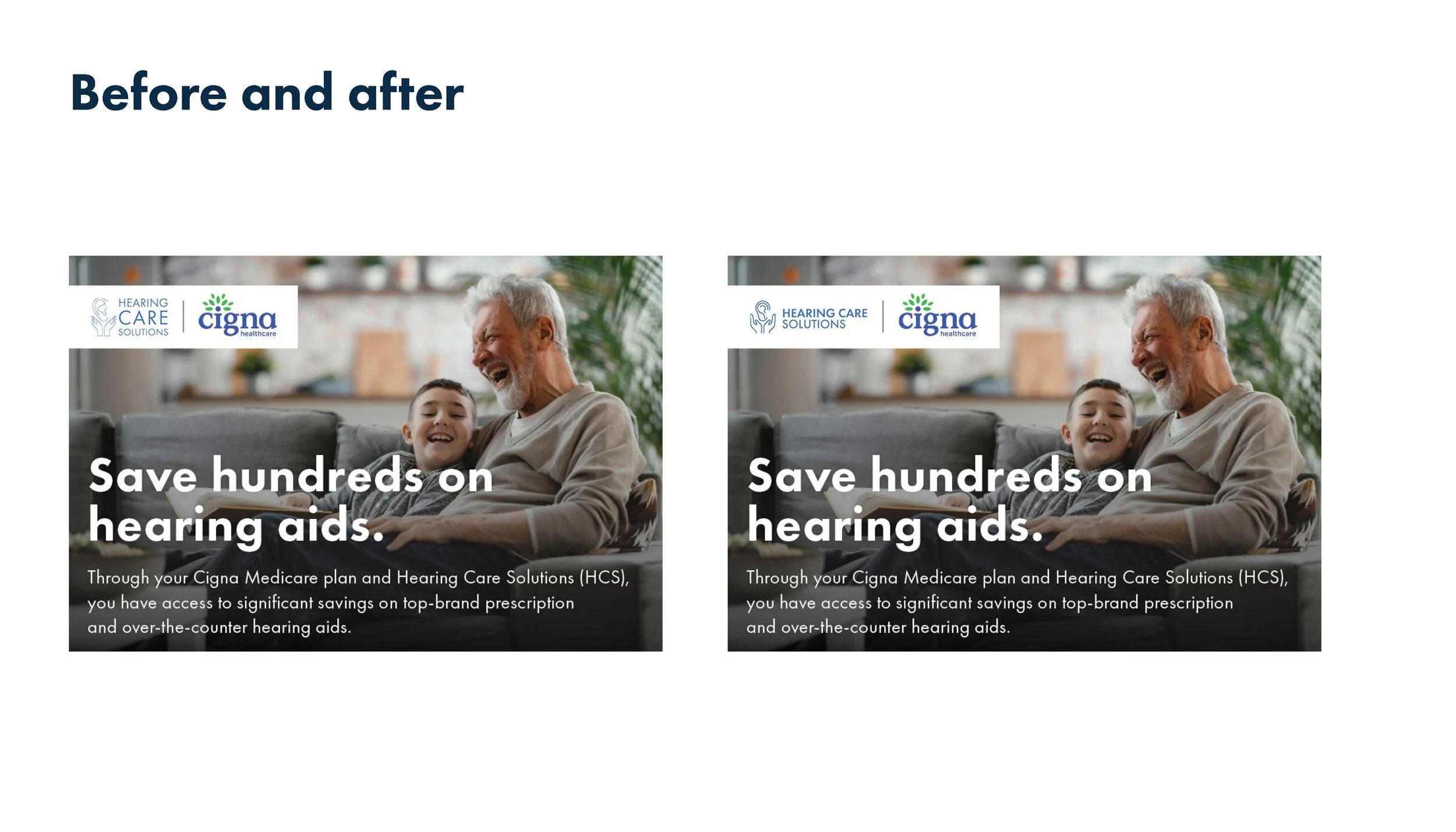
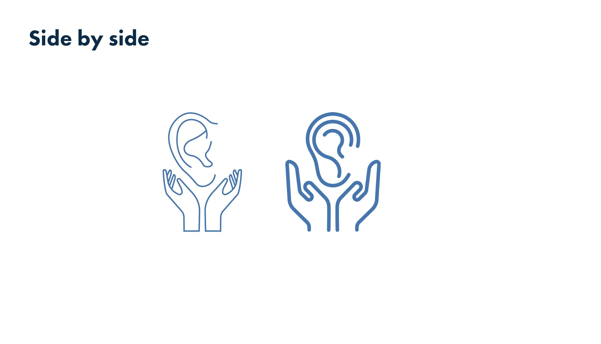
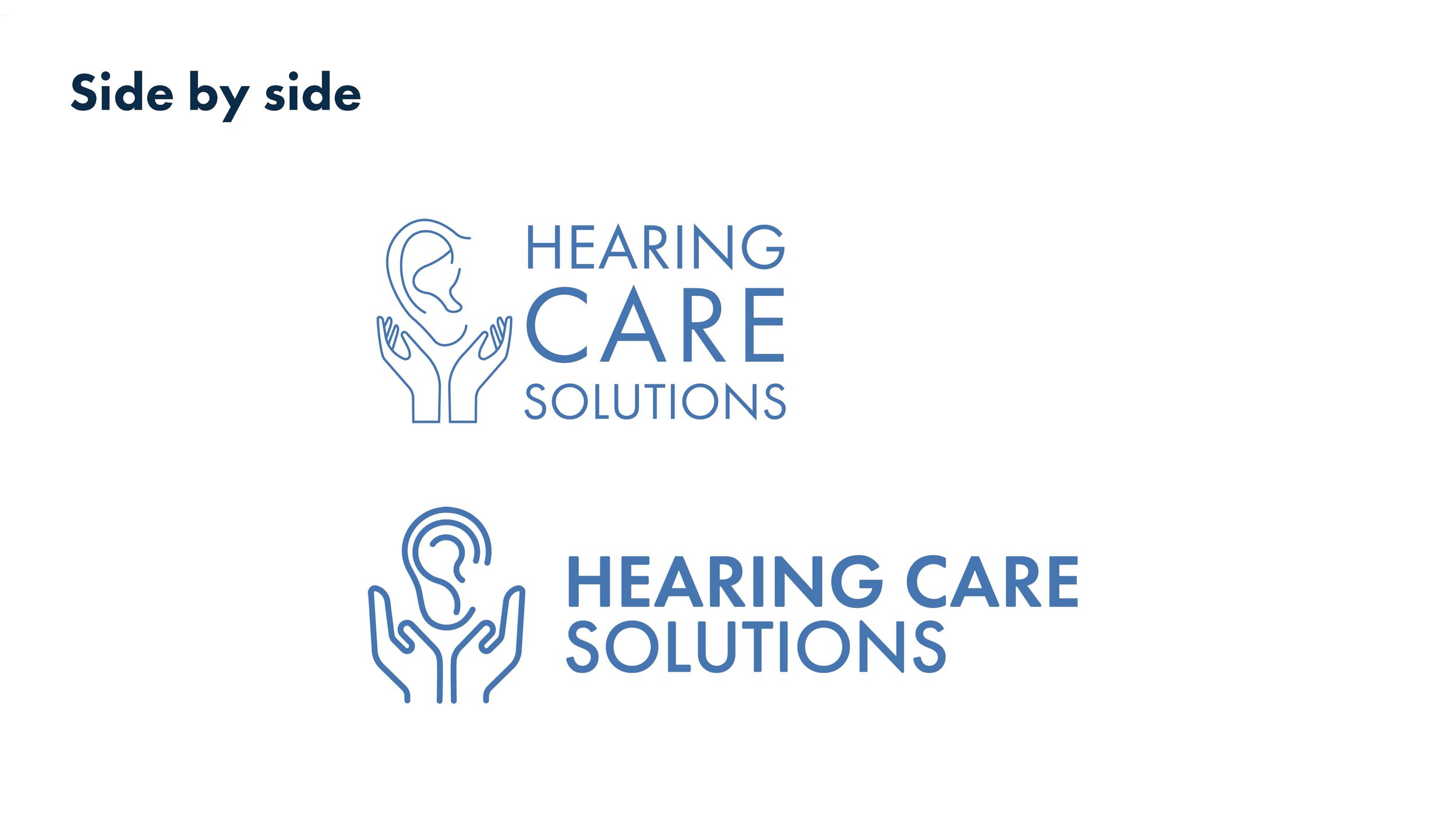
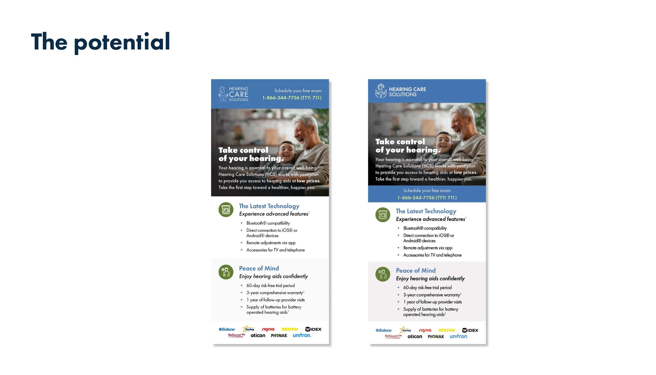
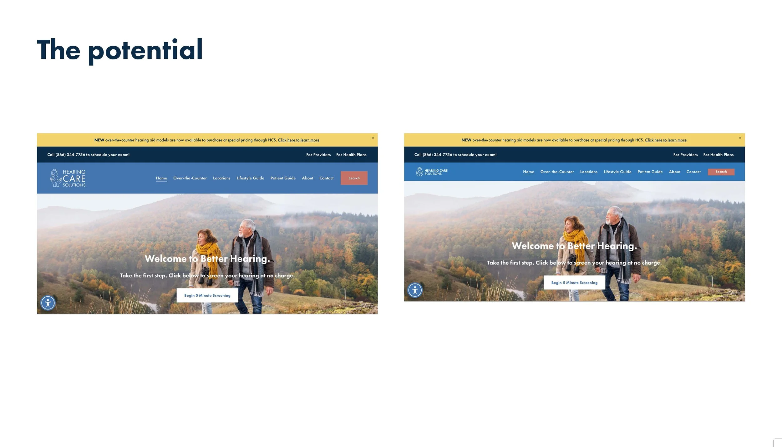
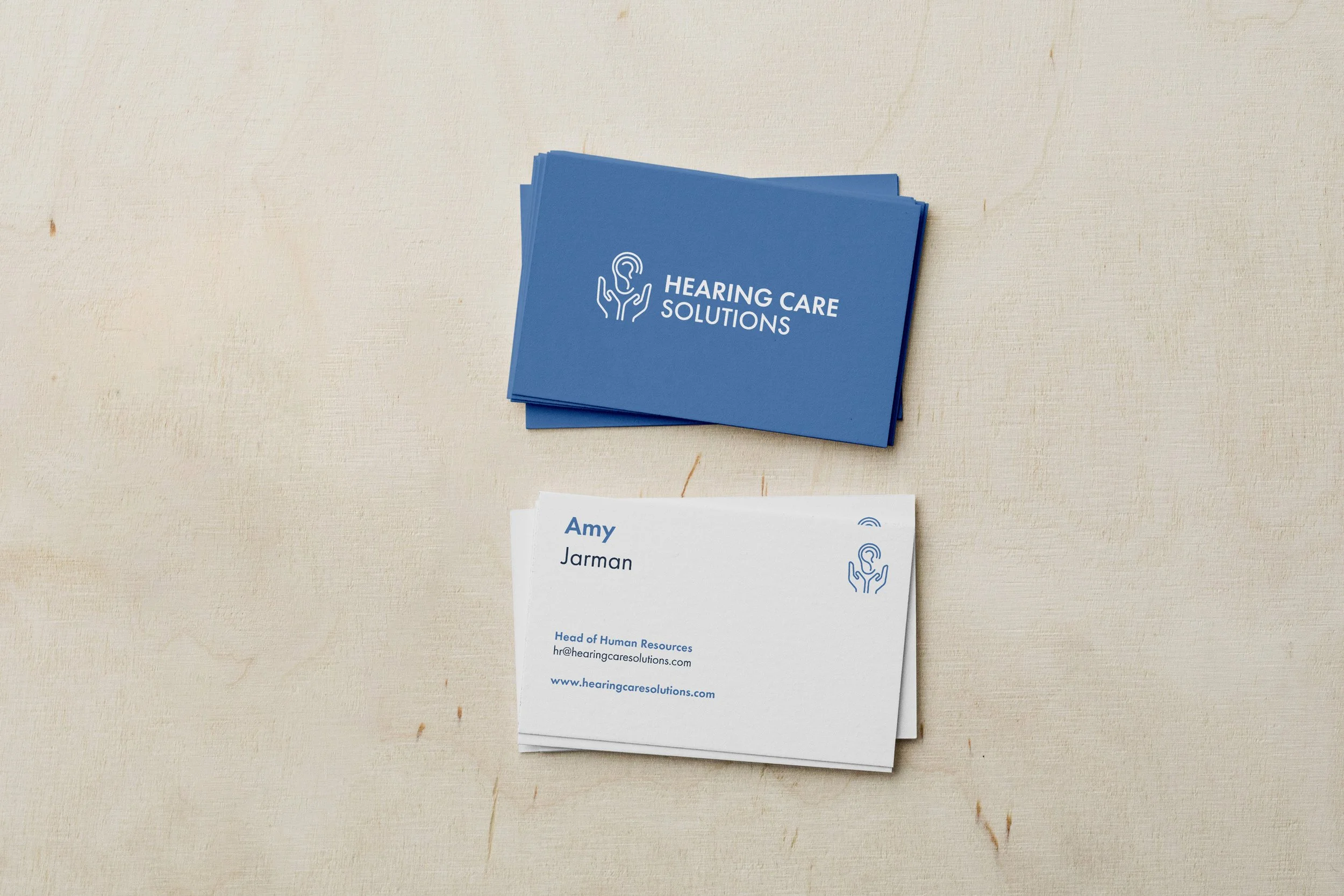
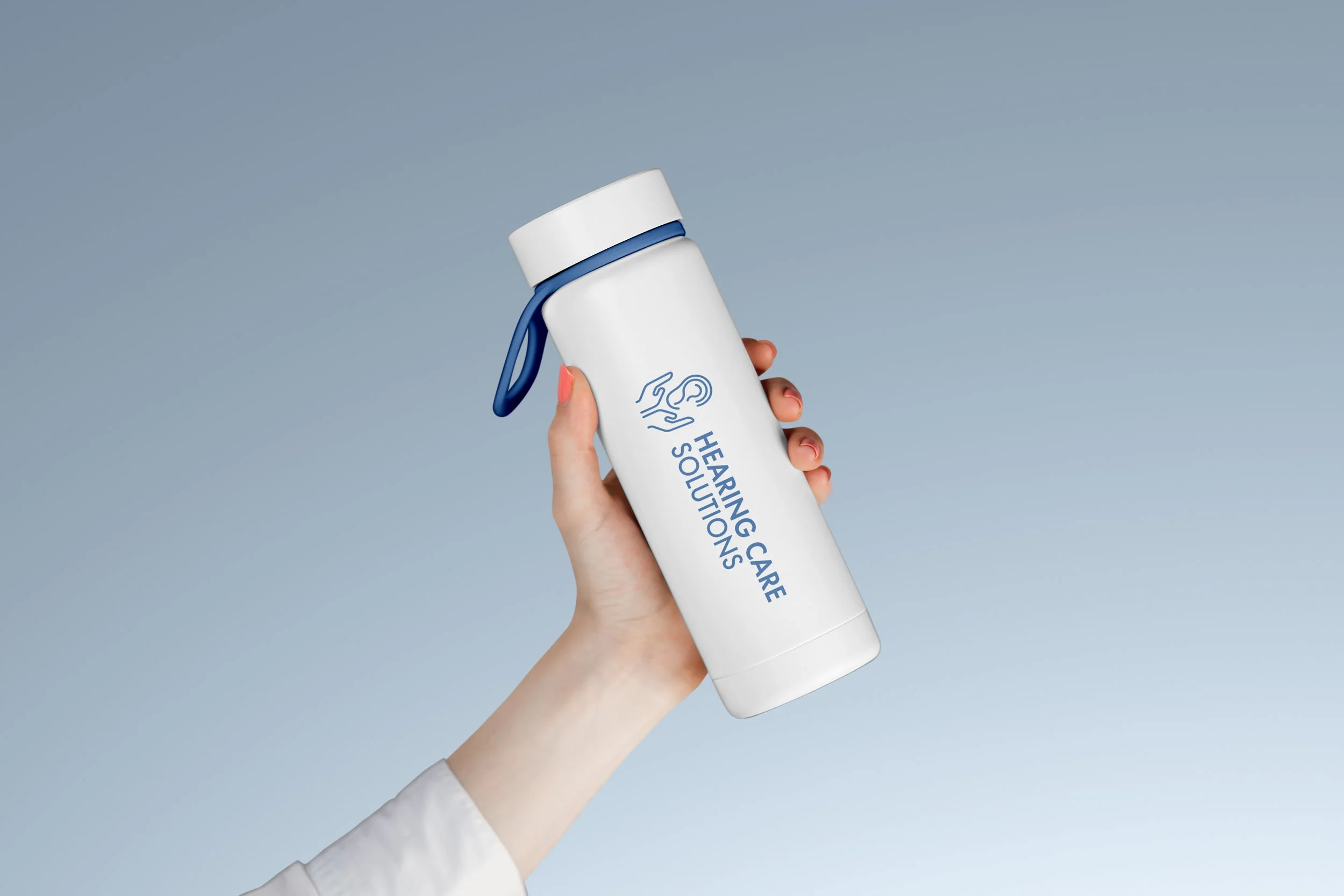
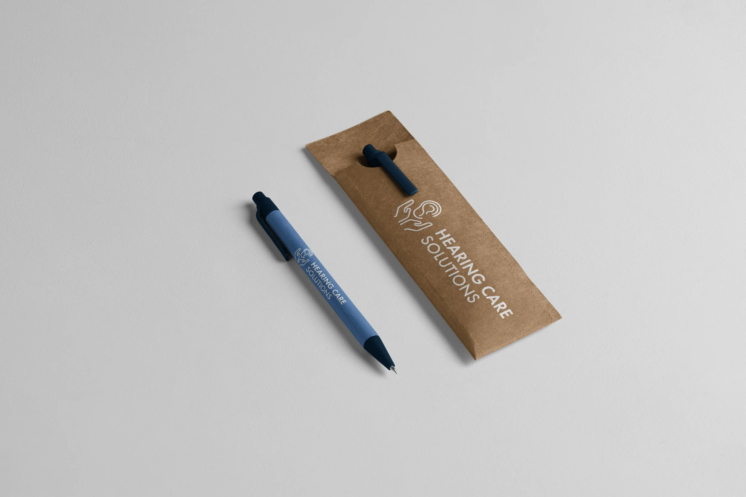
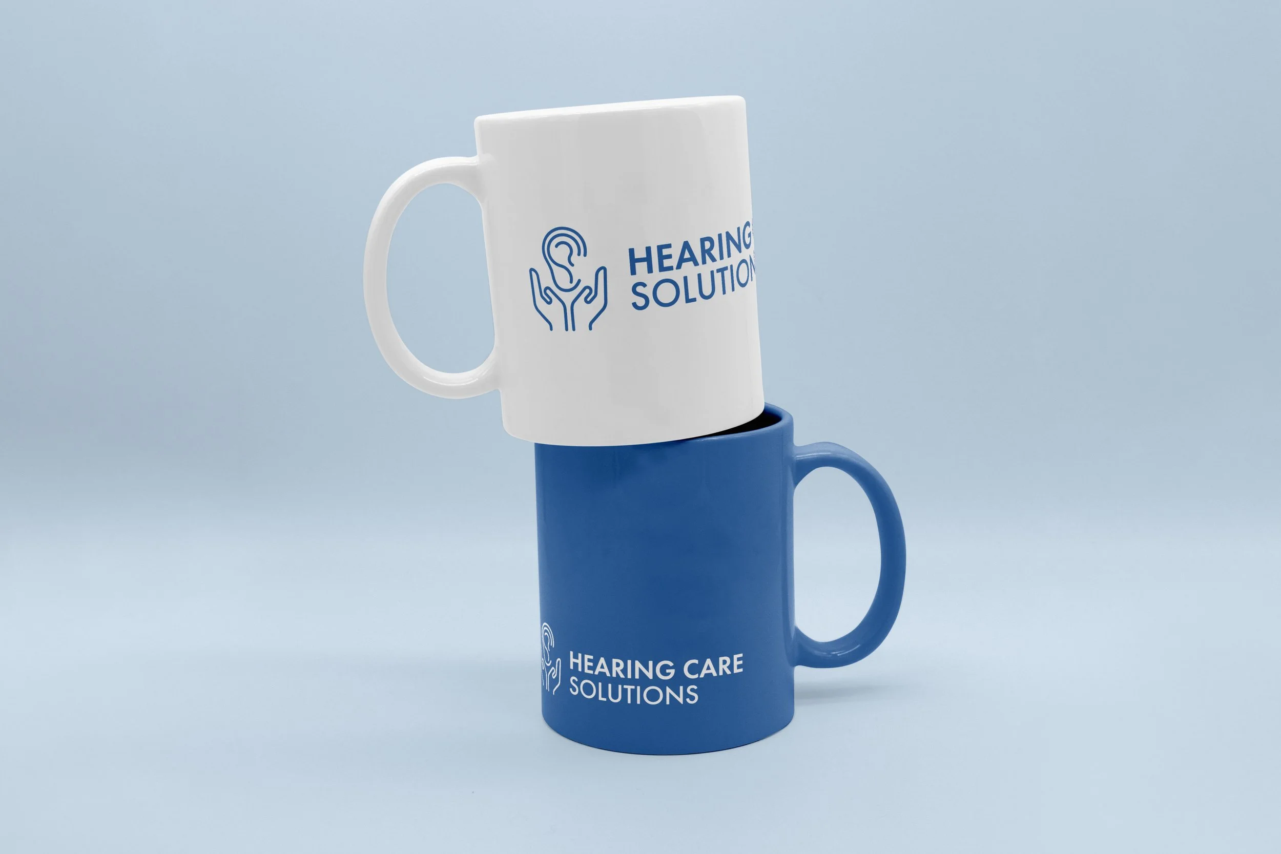
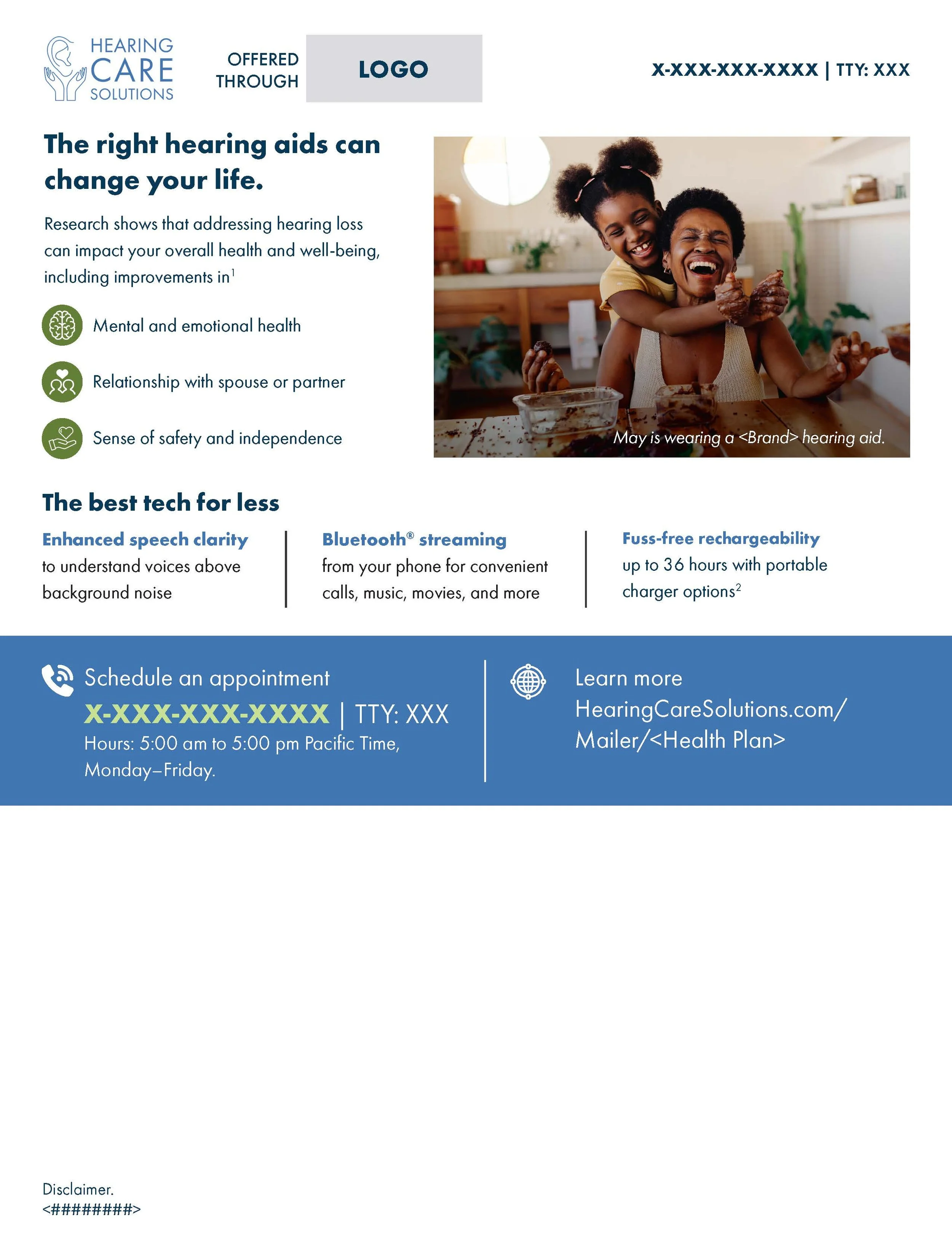
Hearing Care Solutions’ mission was to provide the highest-quality hearing care and instruments at the lowest possible cost. Project work focused on developing flyers, brochures, and other marketing collateral to help patients clearly understand their benefits and use them effectively, while reinforcing the value of high-quality hearing instruments at accessible prices. In addition, a logo evolution initiative was developed to modernize the brand’s visual identity; however, the project was not completed due to the company’s sale and acquisition.


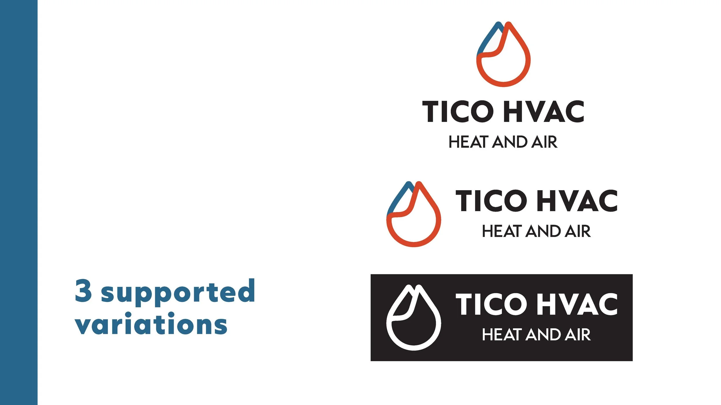
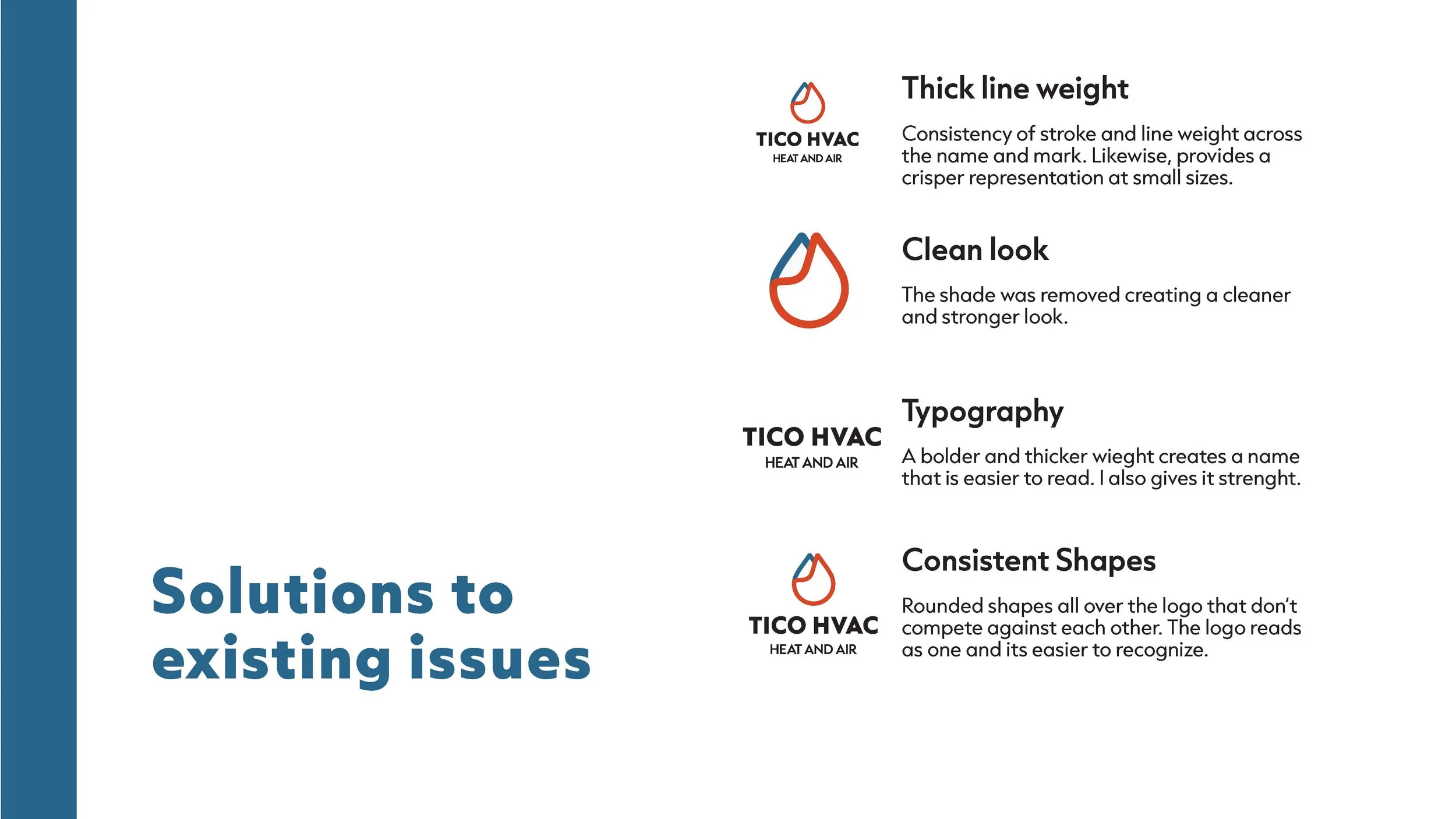
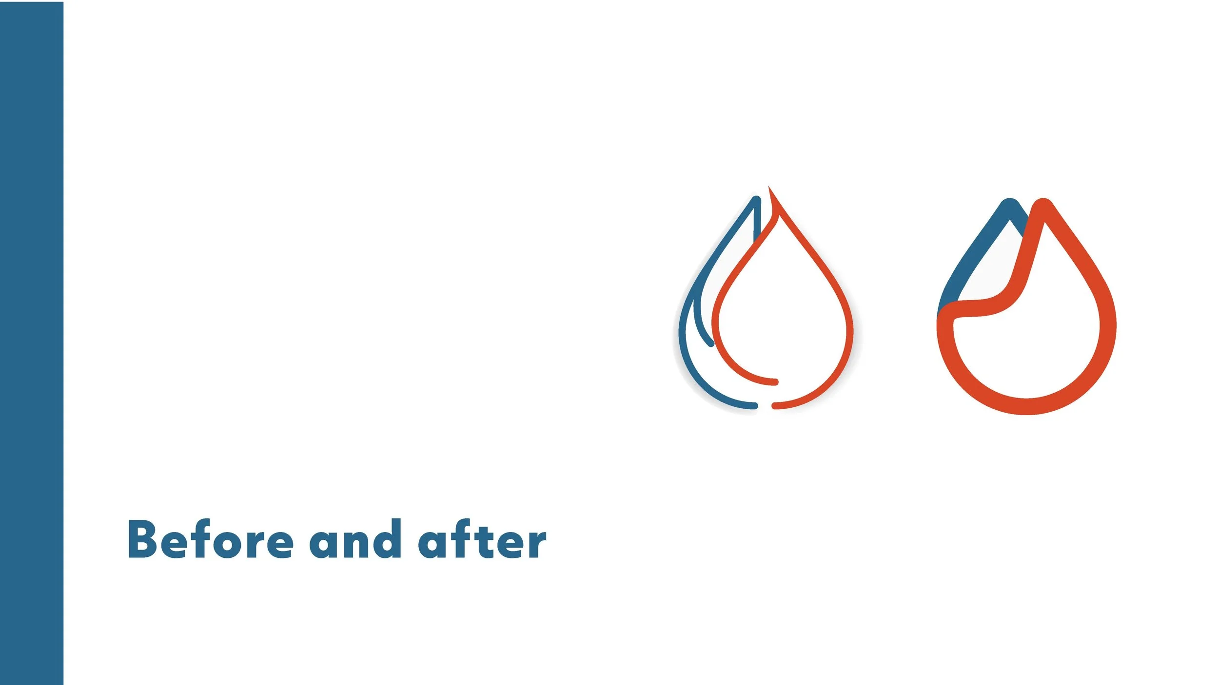
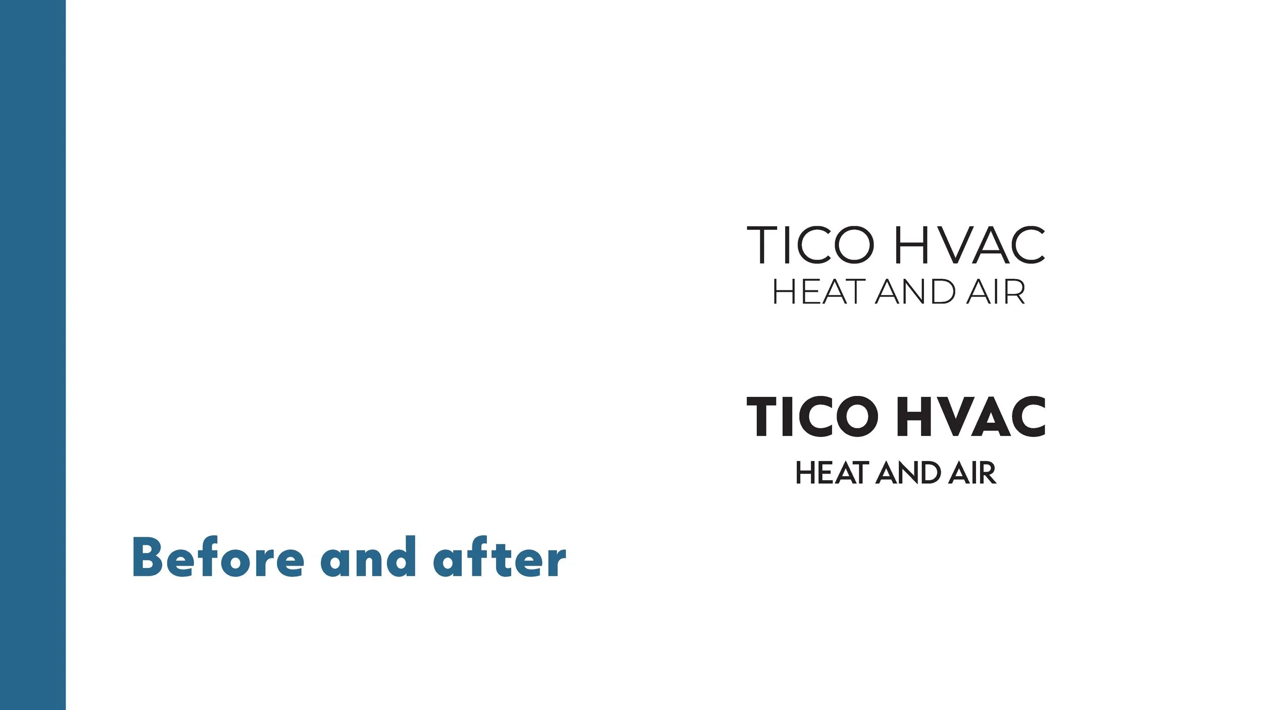
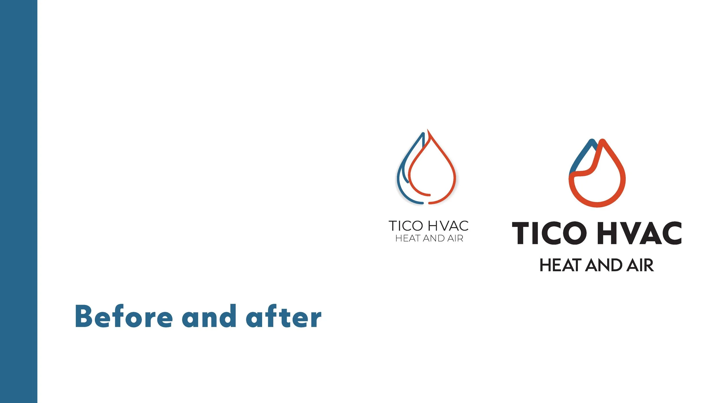
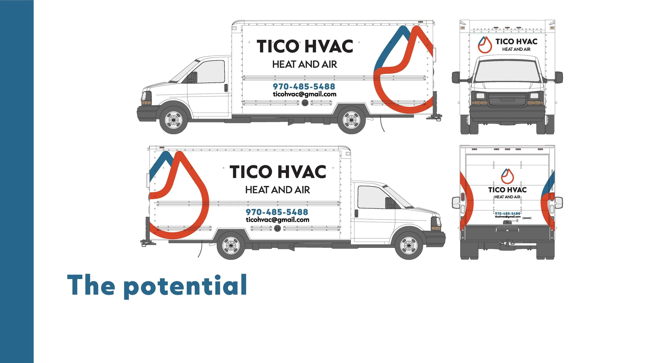
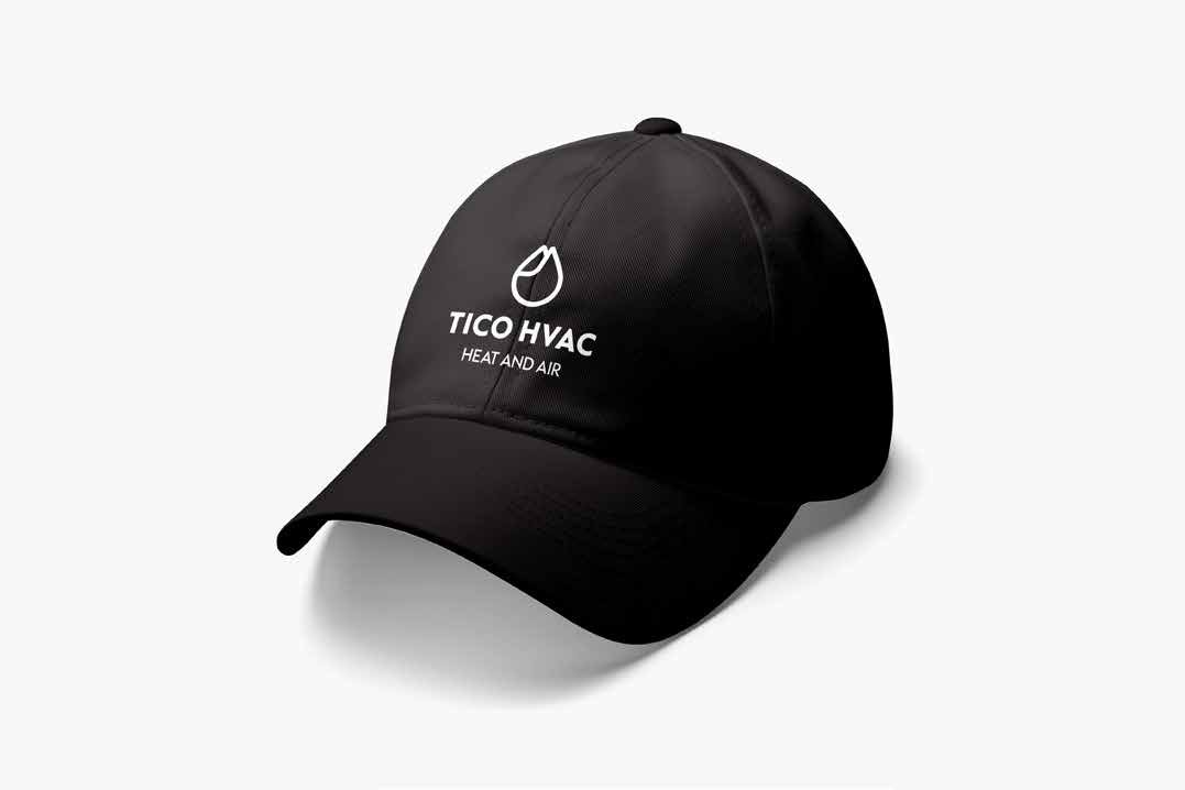
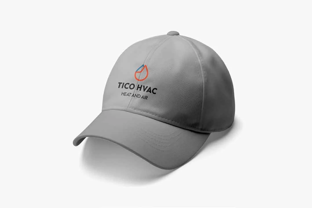
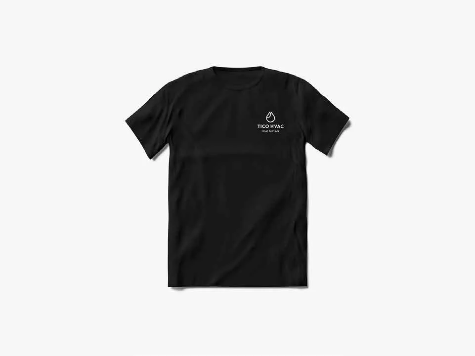
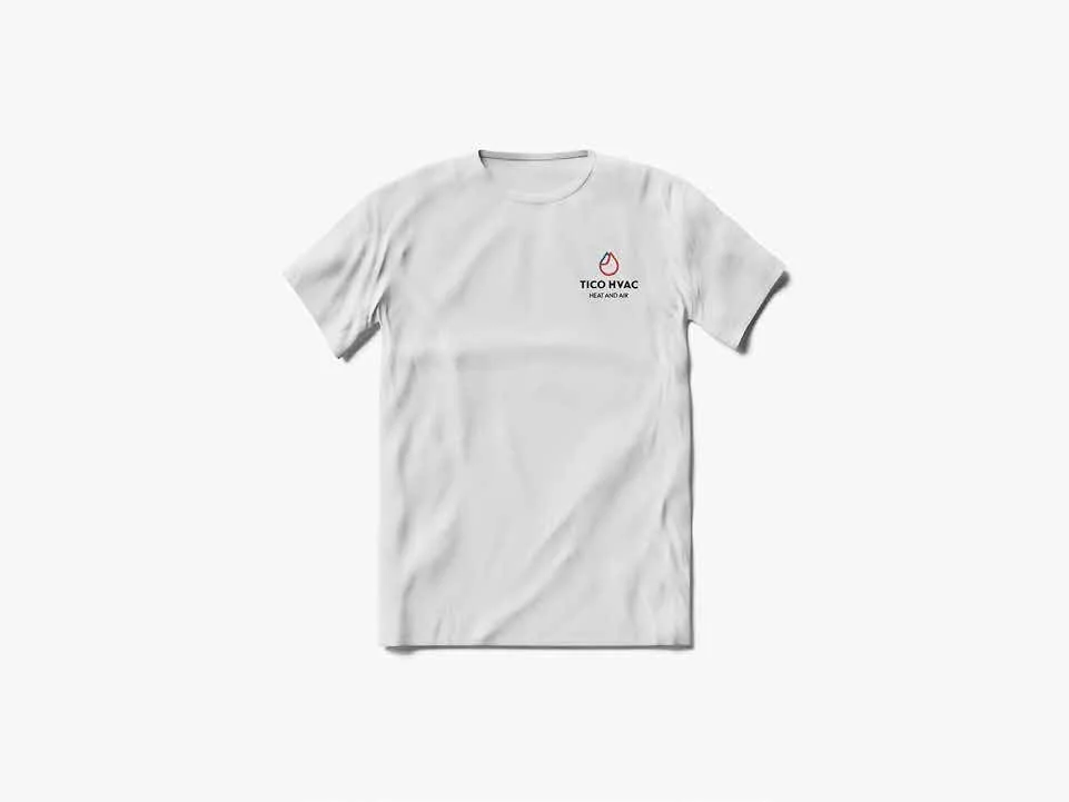
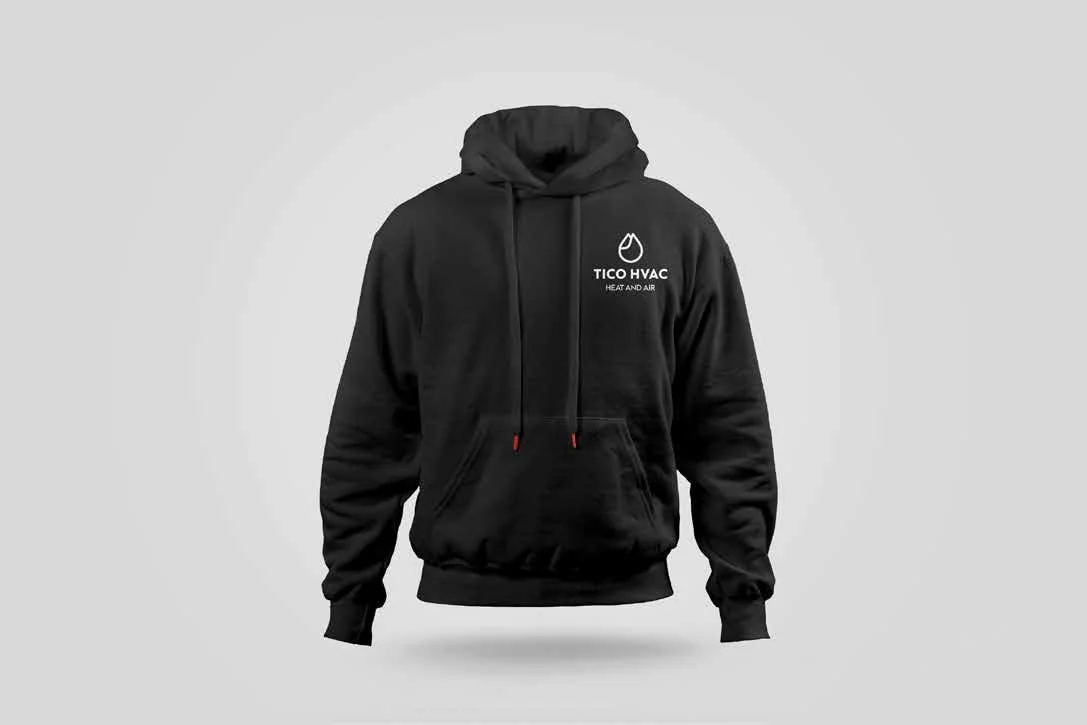
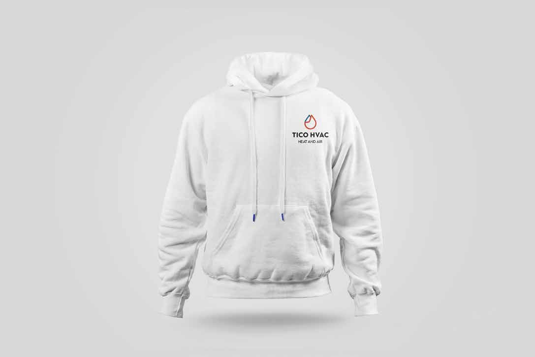
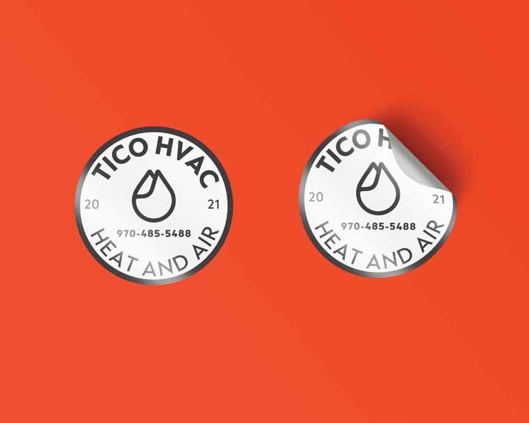
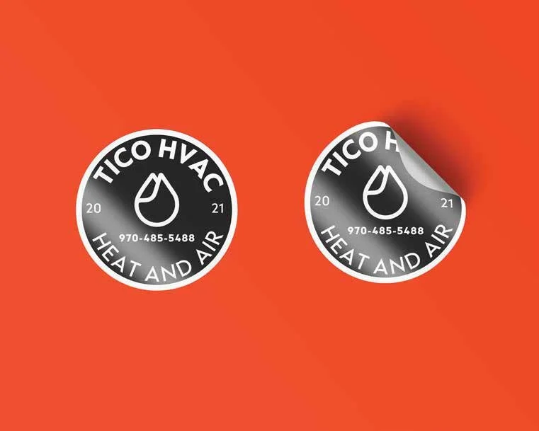
Tico HVAC Logo Evolution
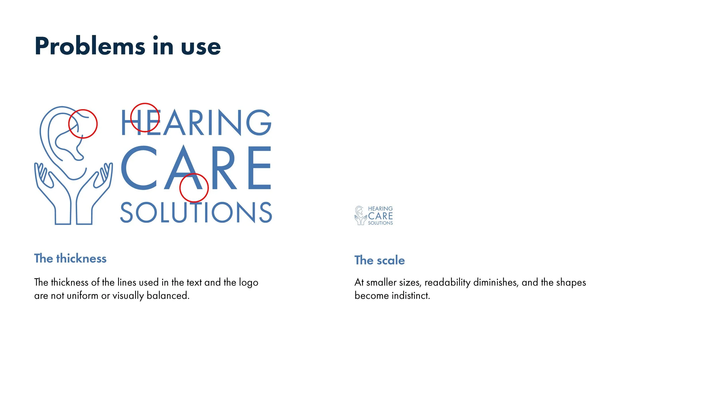
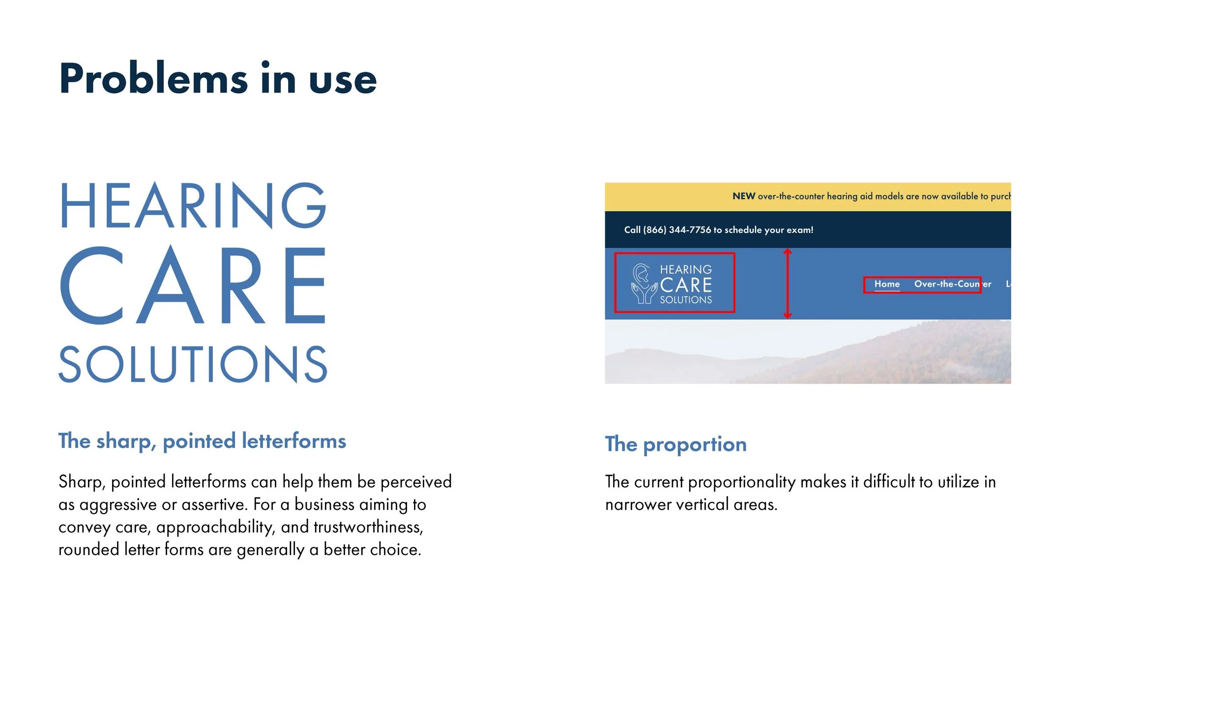
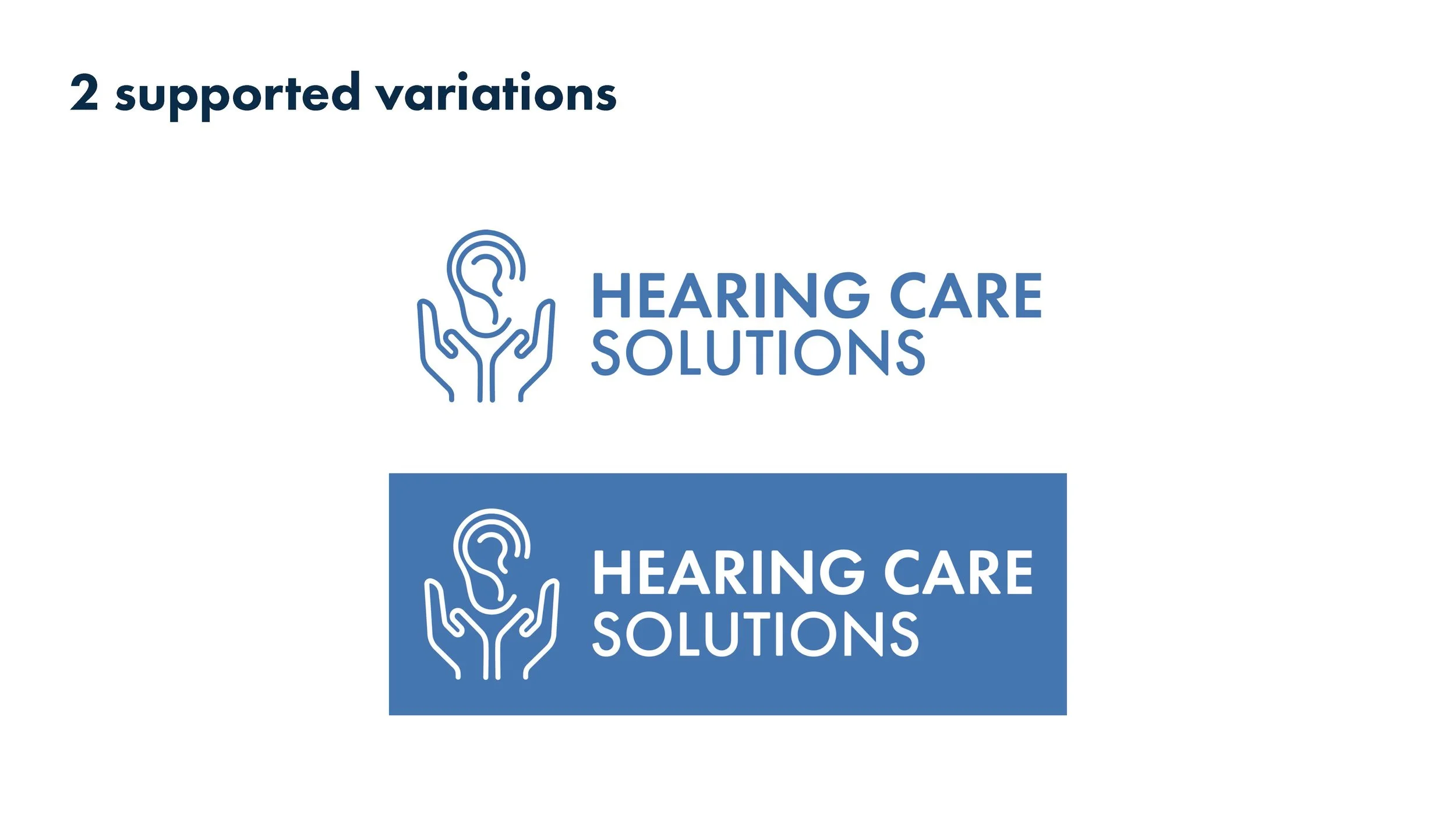
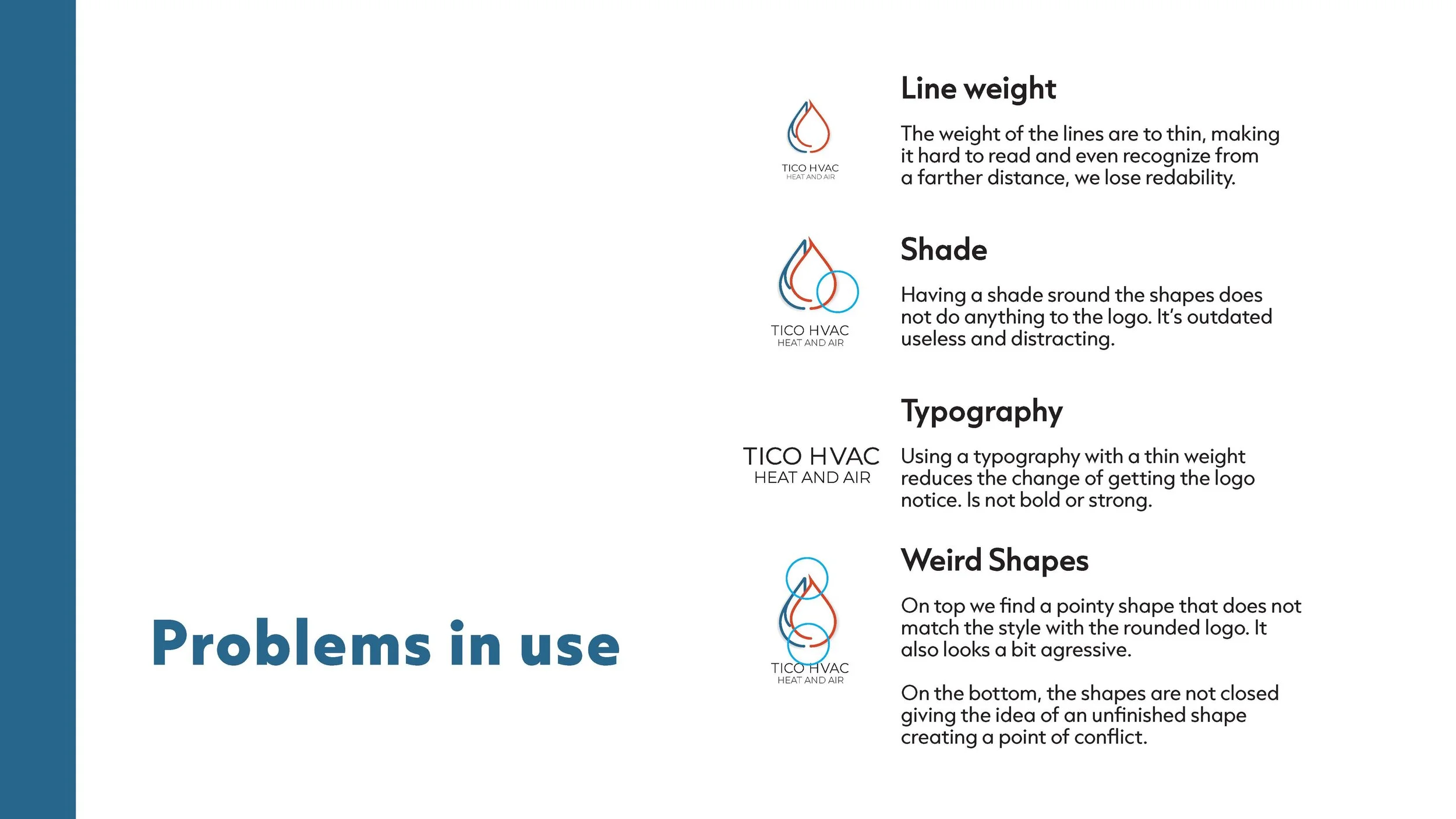
Evolving a logo is important when an existing design has multiple flaws because the logo no longer communicates the brand’s values clearly or effectively. A refreshed logo helps correct visual and conceptual issues, improves legibility and consistency, and ensures the brand feels modern and trustworthy. Logo evolution also allows a company to better connect with its audience while aligning its visual identity with current goals, standards, and market expectation.
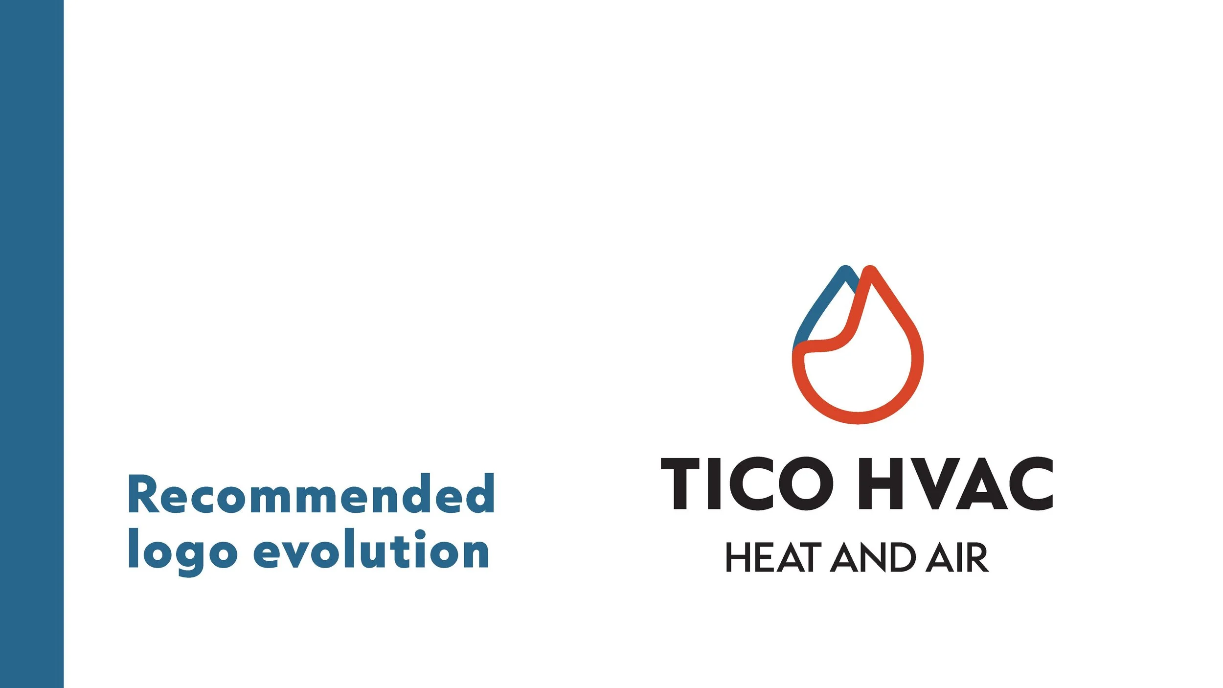
That is why TICO HVAC has adopted a new look—to better connect with new customers and reflect how the company continues to evolve with modern times. While its visual identity has changed, TICO HVAC remains committed to what has always mattered most: excellent customer service and high-quality workmanship.


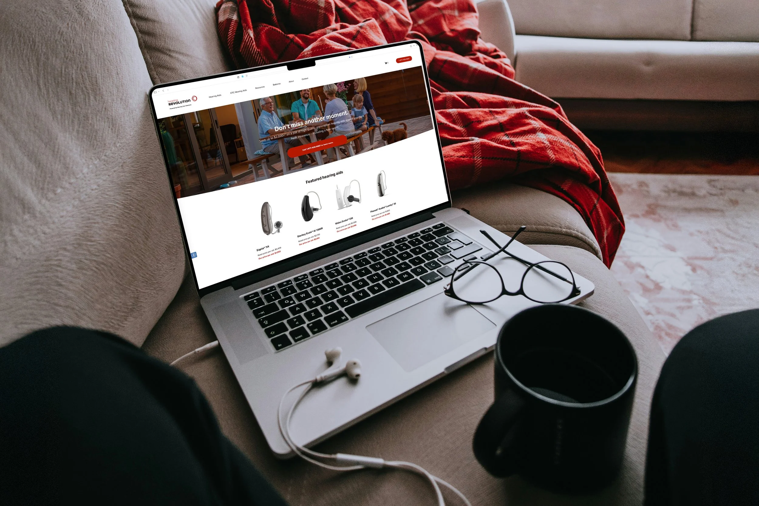
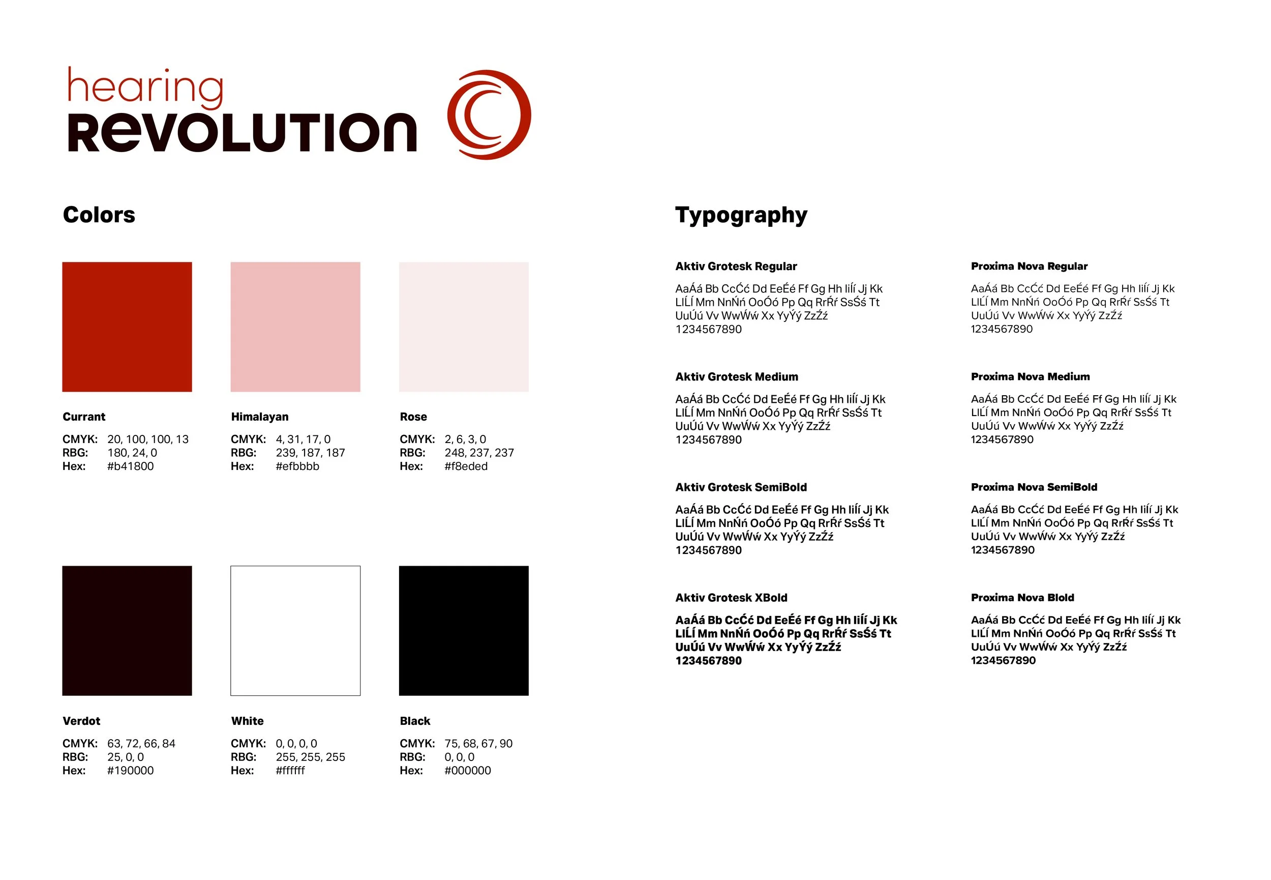
Hearing Revolution
Hearing Revolution: “Best quality hearing aids at the most reasonable price available.” The logo concept was inspired by the sound waves produced by hearing and the way they are perceived by the human ear. Through the use of color and typography, the design aims to communicate a sense of innovation and transformation, reflecting the brand’s commitment to delivering high-quality hearing solutions that remain affordable.
The project including the branding identity was made in collaboration with Senior Graphic designer Ryan Hruska Jr, and completed while employed at Hearing Care Solutions.

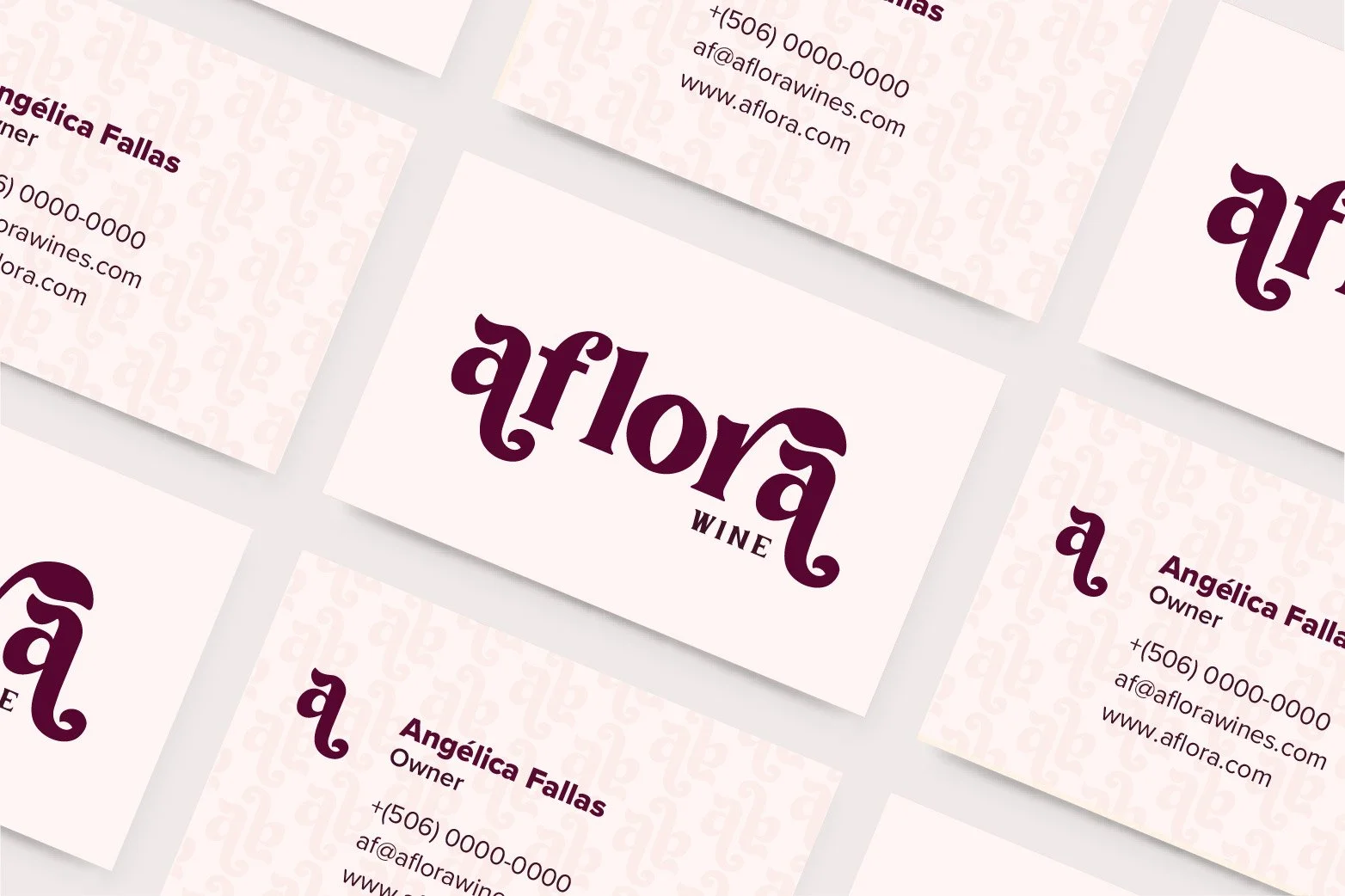
Aflora Fruit Wines
Angelica and her family are embarking on a new family business: crafting wine from unique fruits, not just grapes. Their plum orchard provides a wealth of resources, and what better way to utilize them than by creating a delicious wine? "Aflora" is a fitting name, symbolizing the blossoming of their passion for fruit – a passion that started with the flower and flourishes through their family's hard work.


Fofo’s Coffee
Adolfo grew up in Costa Rica and, many years later, came to Denver, Colorado. He inherited his grandfather's coffee-cultivating business, a family legacy passed down through generations. Fofo's Coffee is nurtured by the family's effort and dedication, and decades of experience have culminated in a high-quality coffee recognized internationally. Grown in the renowned Tarrazú Coffee Region, the beans are a testament to the family's legacy.
To honor his grandfather and connect with a new generation, Fofo’s Coffee was born: a brand with a modern design. The logo combines the greenery of the Tarrazú mountains, the golden sun shining on the lands of the Saints, and the iconic golden bean.


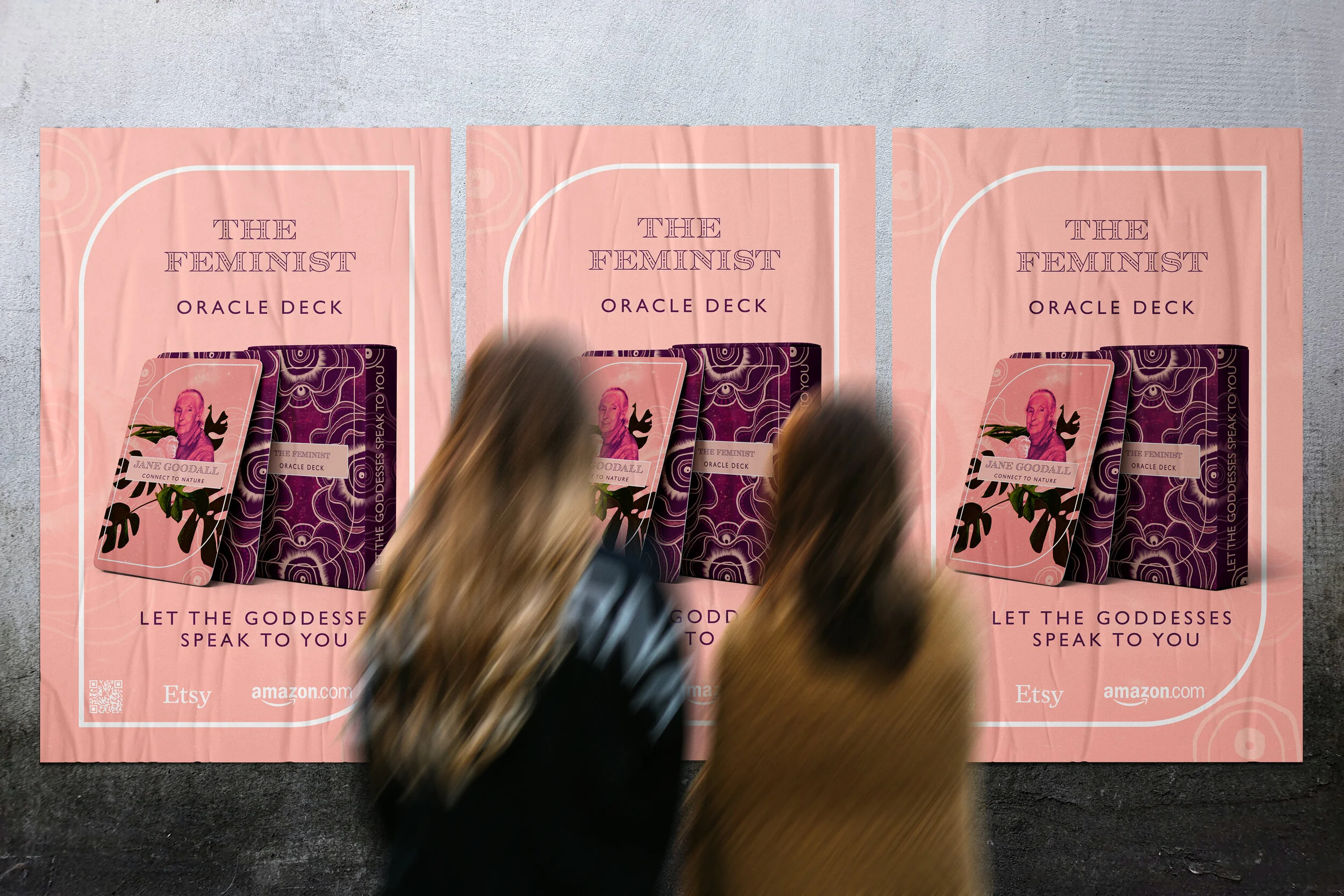
Feminist Oracle Cards
The Feminist Oracle Cards feature images of powerful women alongside empowering words. A booklet explains their accomplishments and how they changed the world. Anyone who owns a deck can draw a card each day, read about the woman depicted, and gain a sense of empowerment. Like the Oracle cards, people can also find guidance or words of wisdom in unexpected places.
The project's inspiration stems from a desire to create a balance between the mind, body, and spirit. It also addresses the need to empower women globally to create, grow, and take action in a world that has traditionally been designed for men.


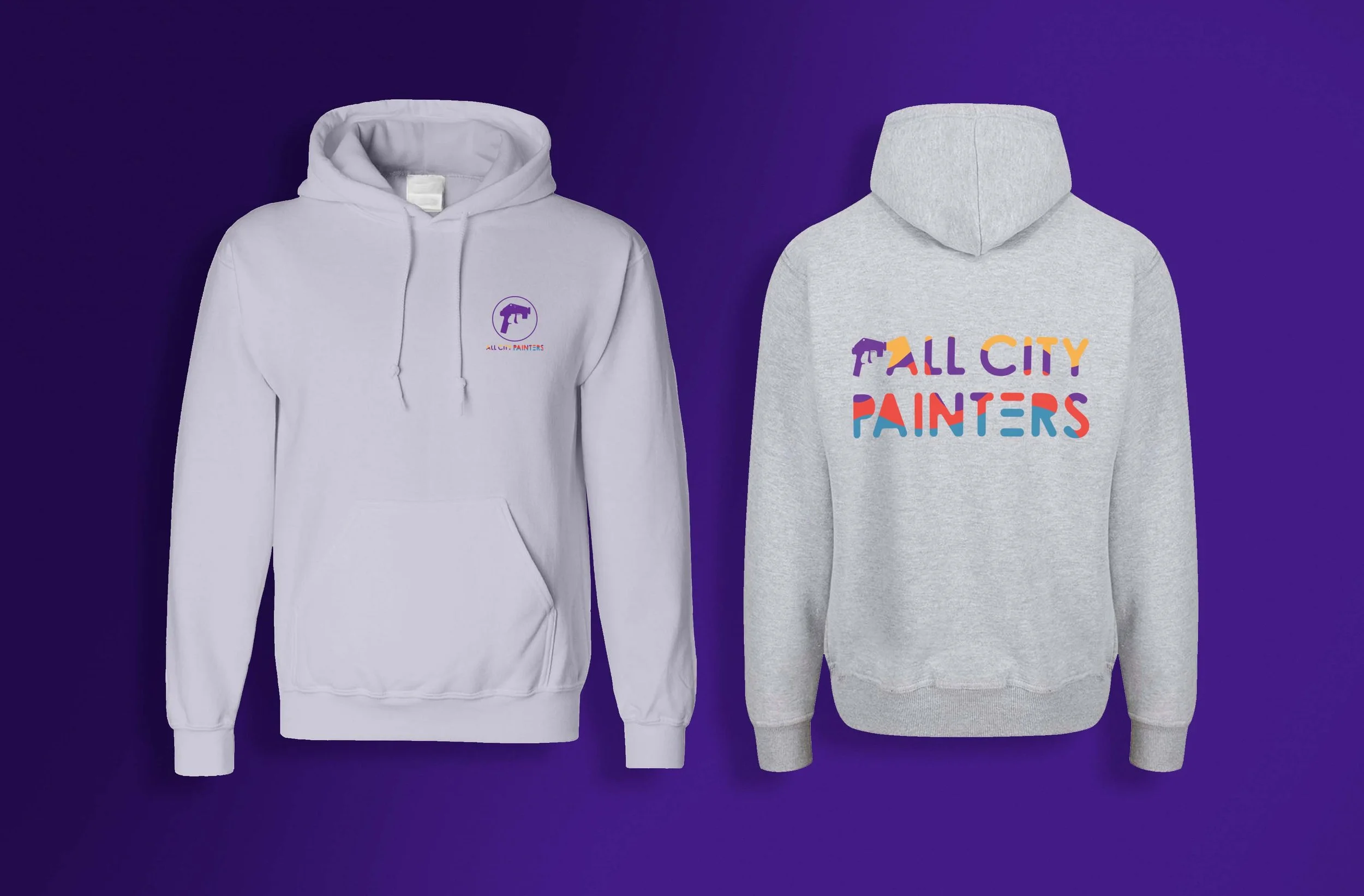
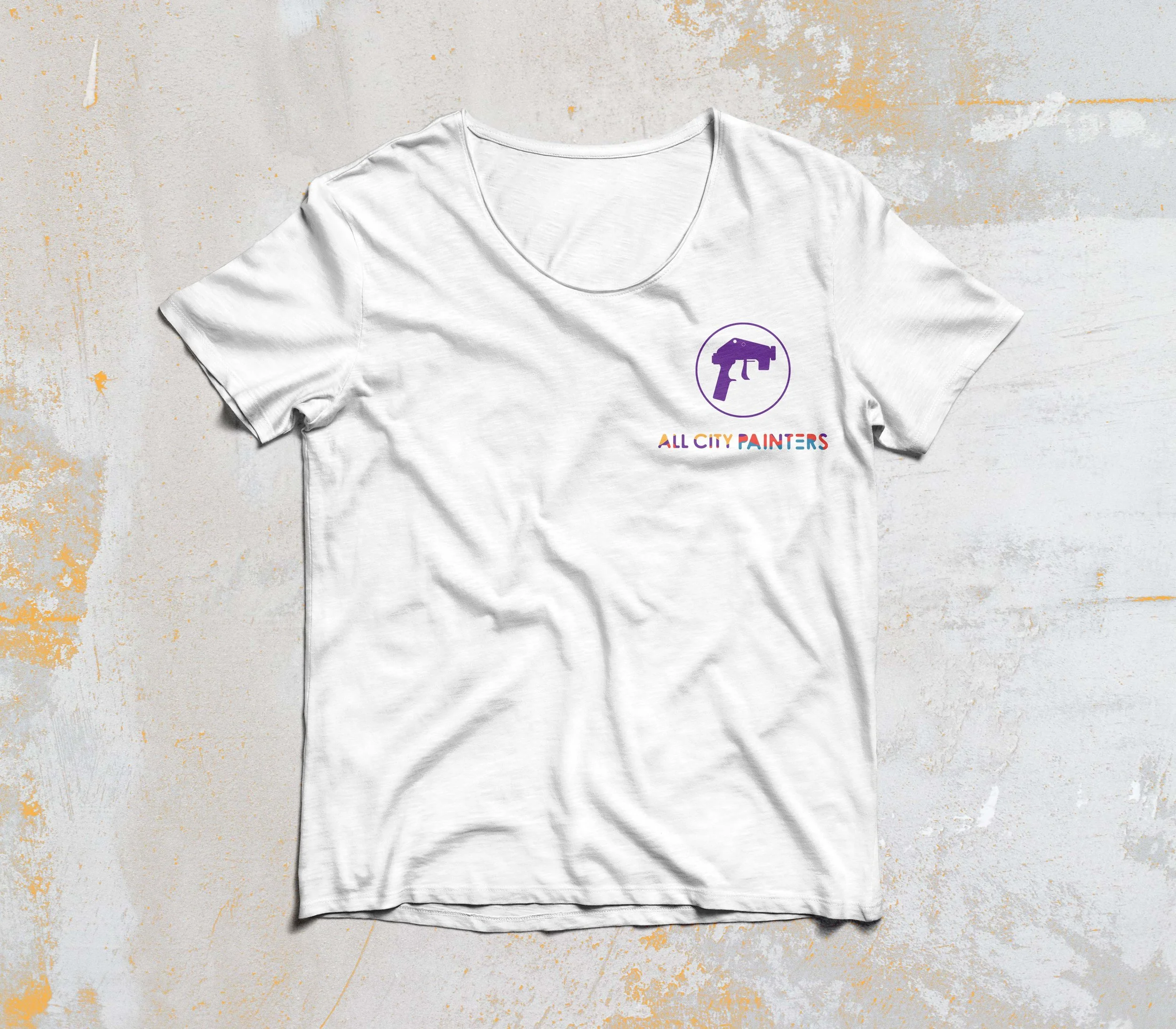
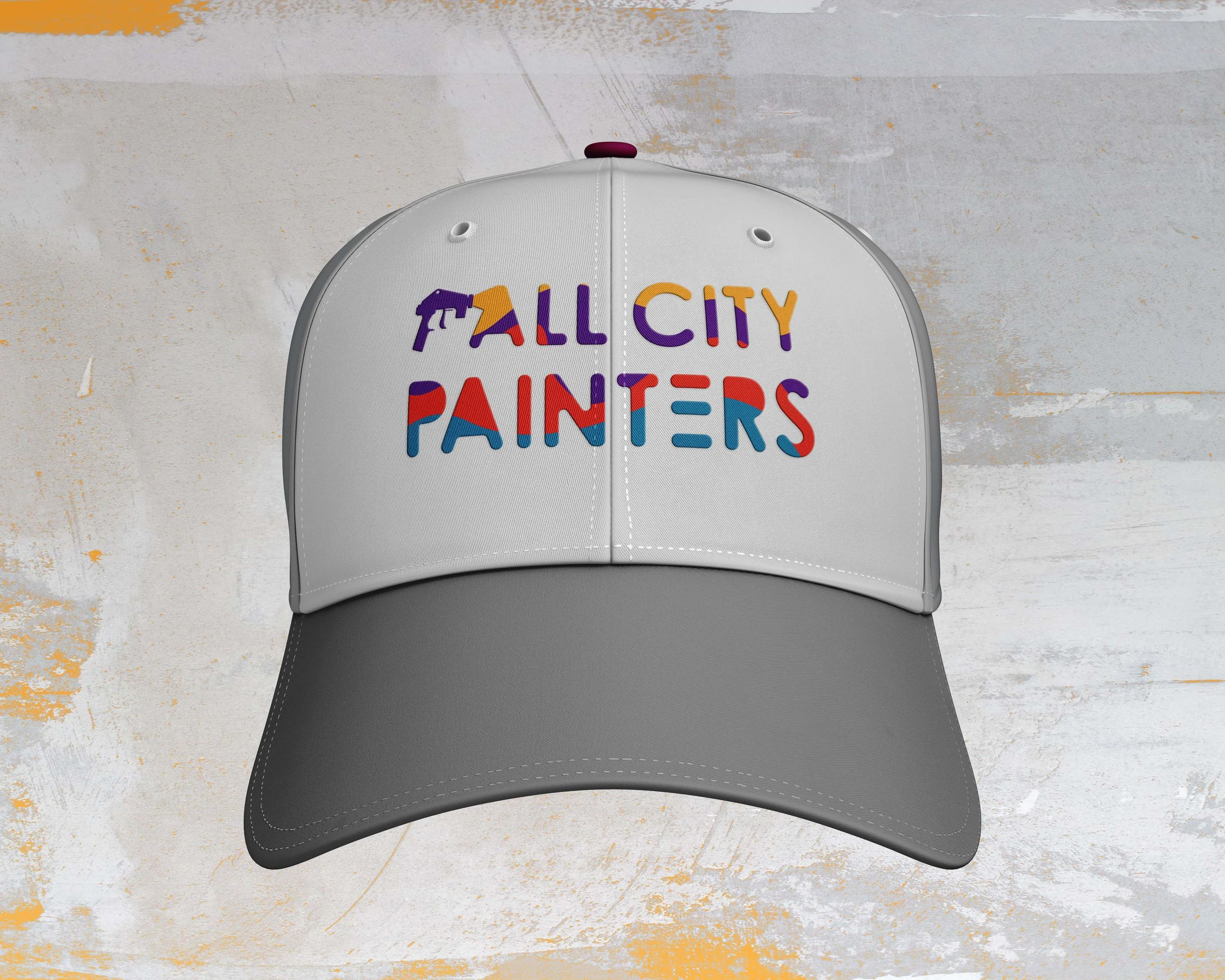
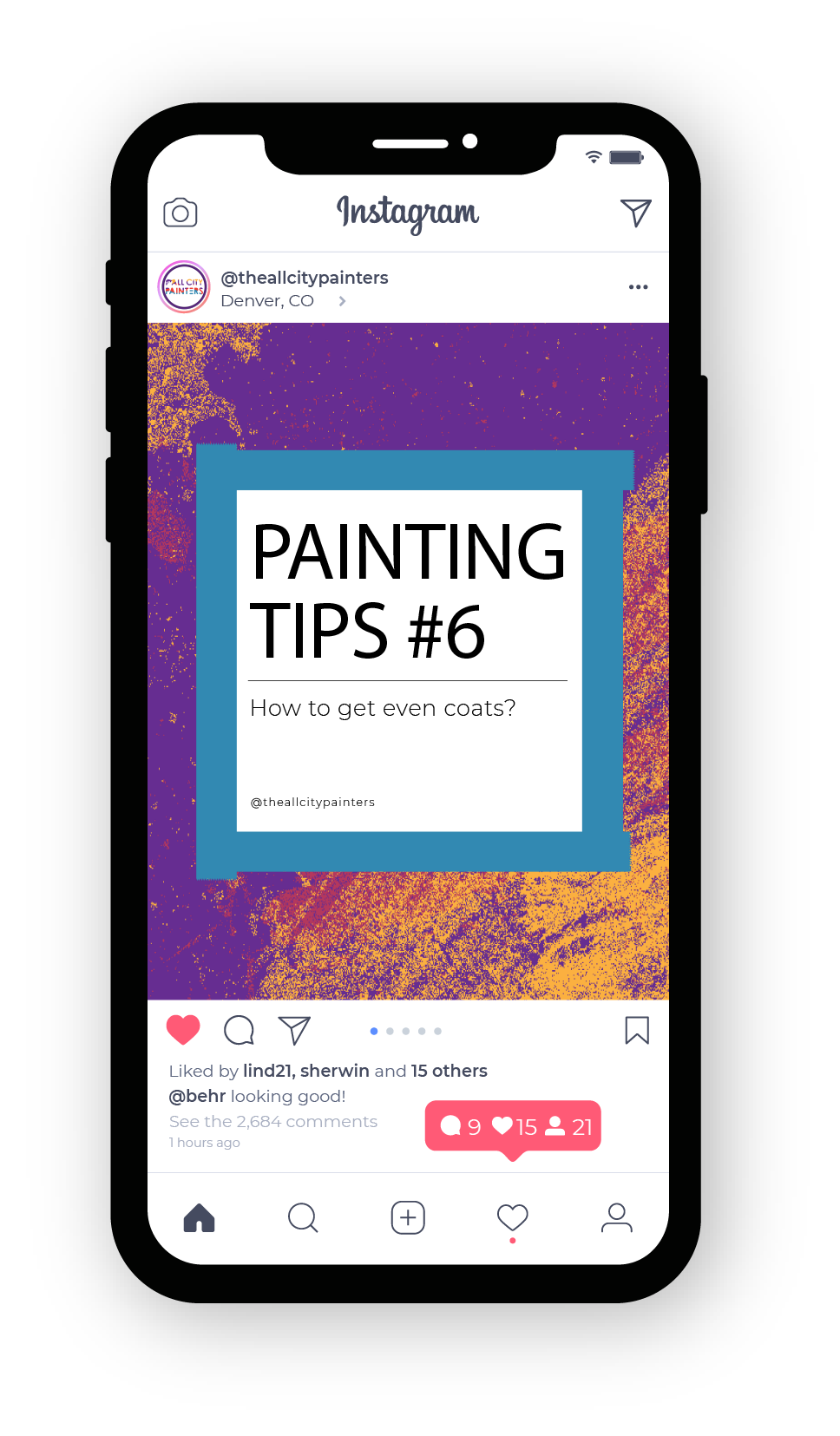
All City Painters
All City Painters, a Denver company, is looking for a new image. They want a fresh, modern look that is full of color and vibrancy. Renovating their image is important because the owner's son is taking over the business and wants to express a modern design aesthetic.


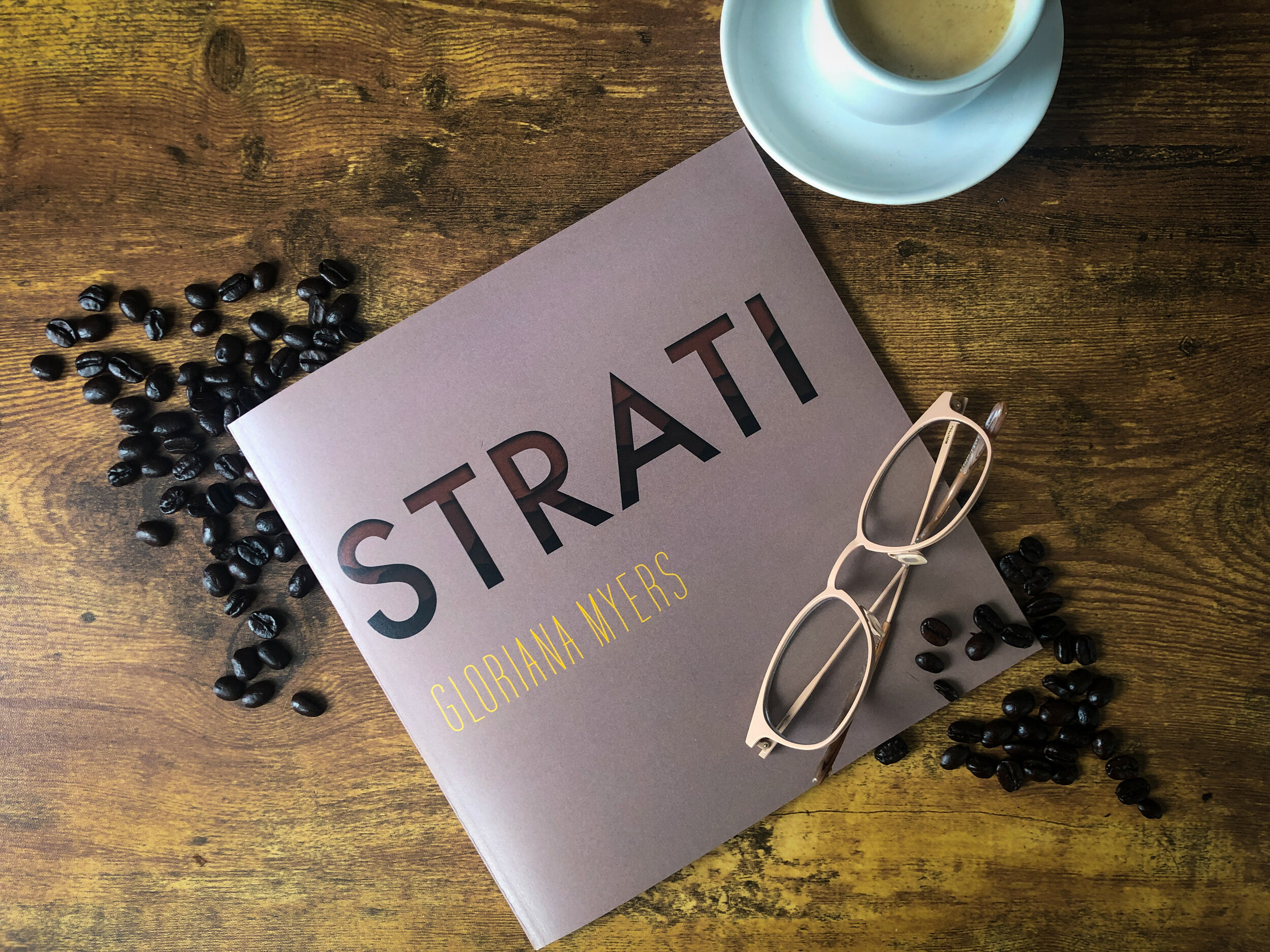
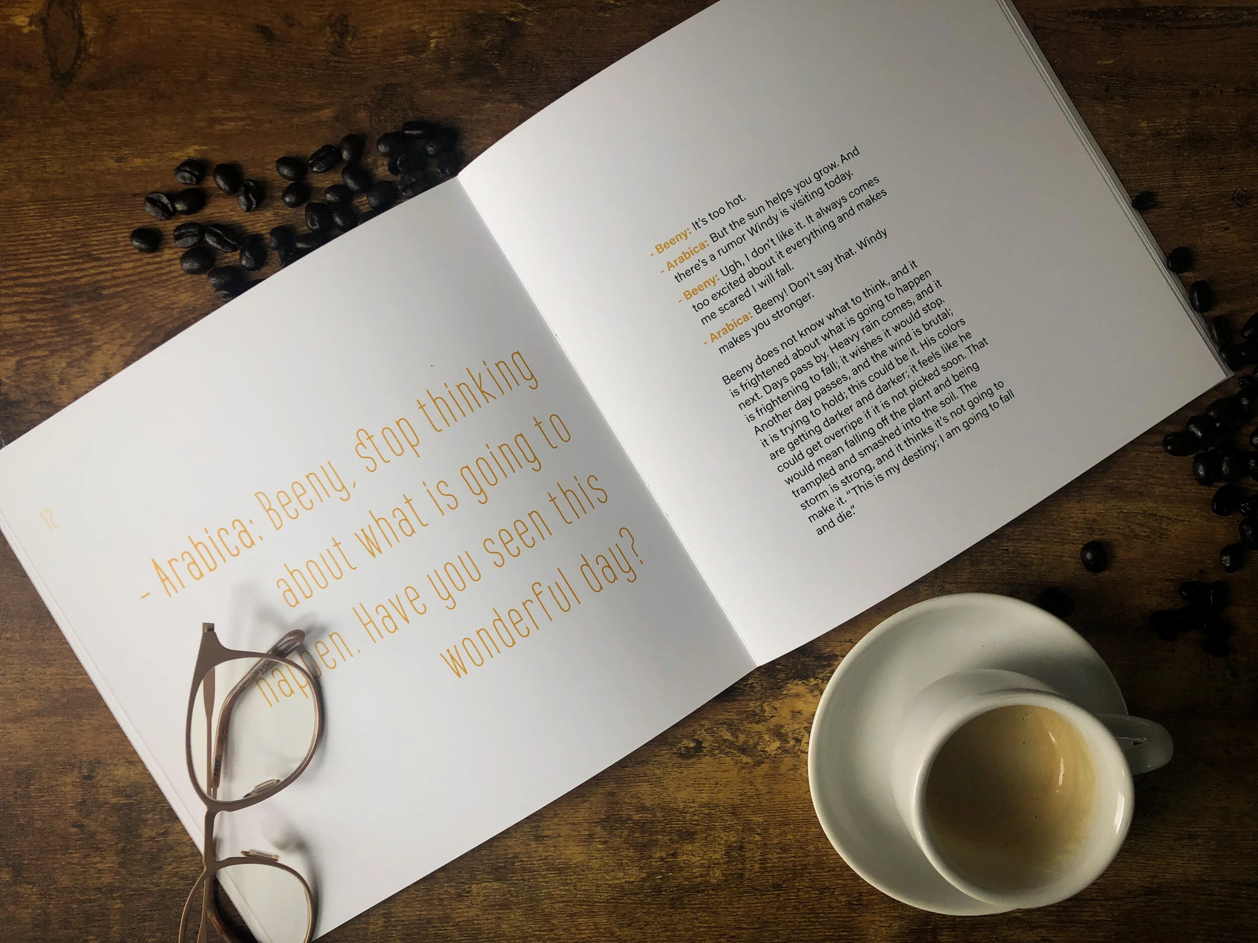
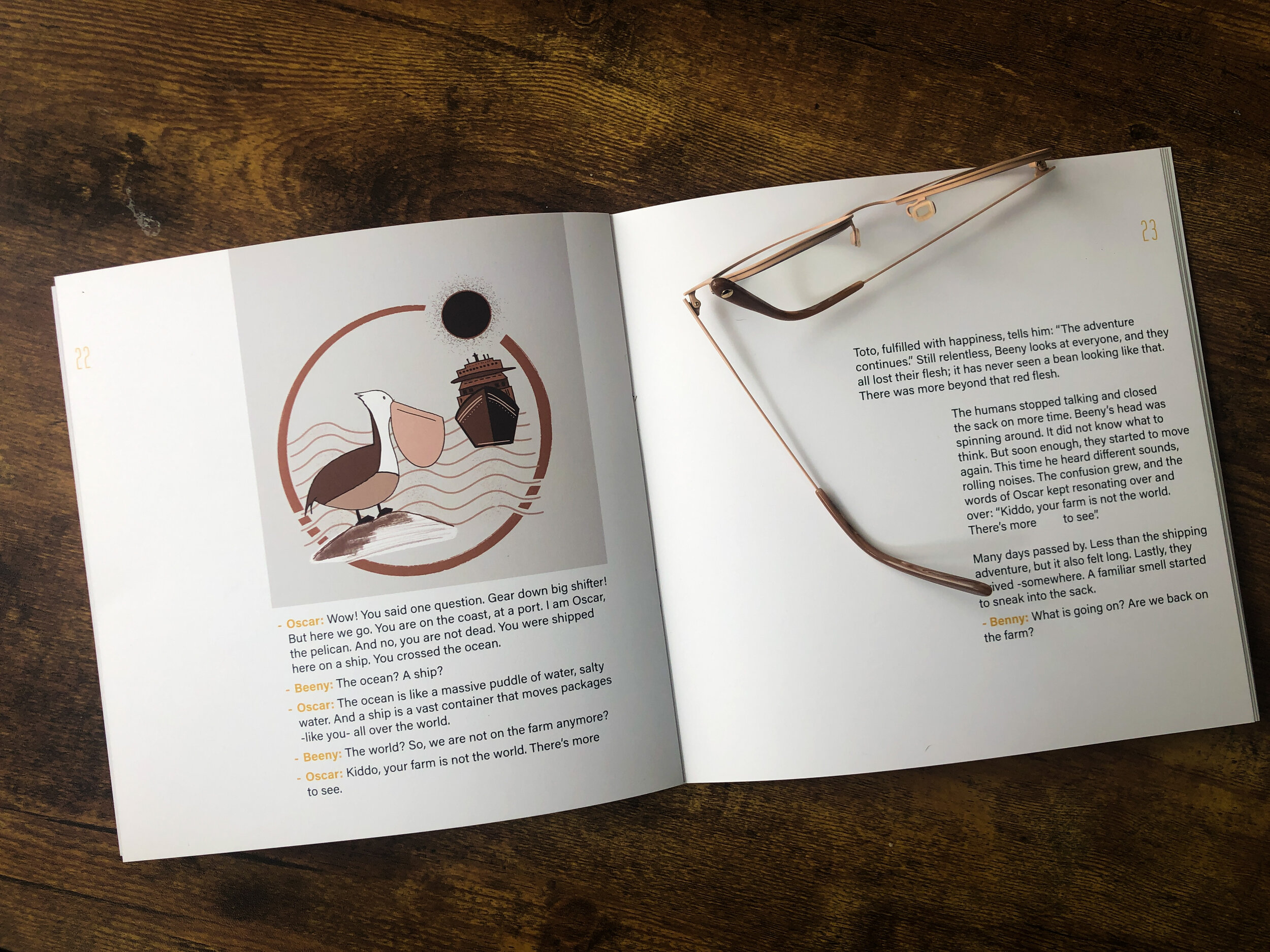
Strati
The book, designed and printed in an 8x8 format, features illustrations that guide the reader on a journey with a life lesson we all can learn. "Strati" means "layers" in Italian, and as Beeny interprets it, the story explores peeling back the layers of our shell, just like a bean naturally does. The goal is to cultivate awareness of living in the present moment. It encourages us to enjoy life as it unfolds, embracing both the happy and sad moments, and ultimately, letting go of the latter.


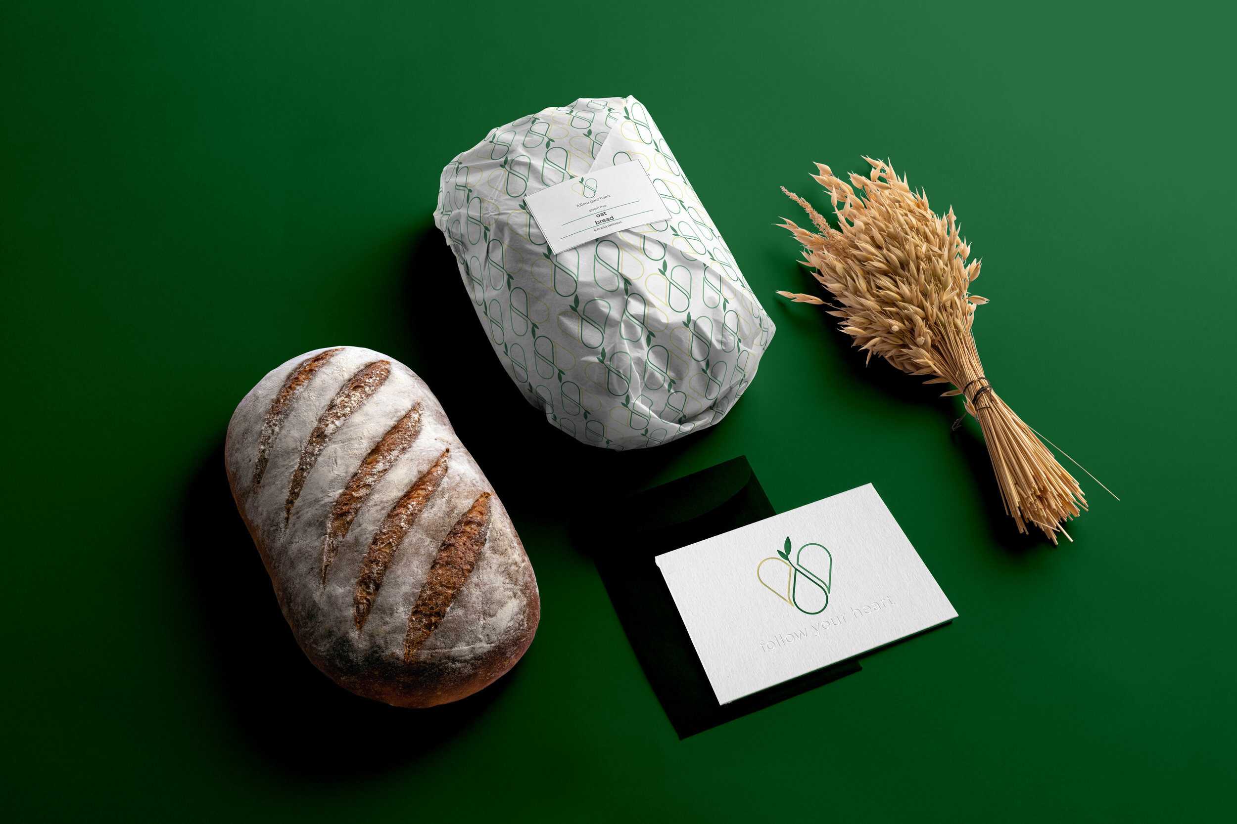
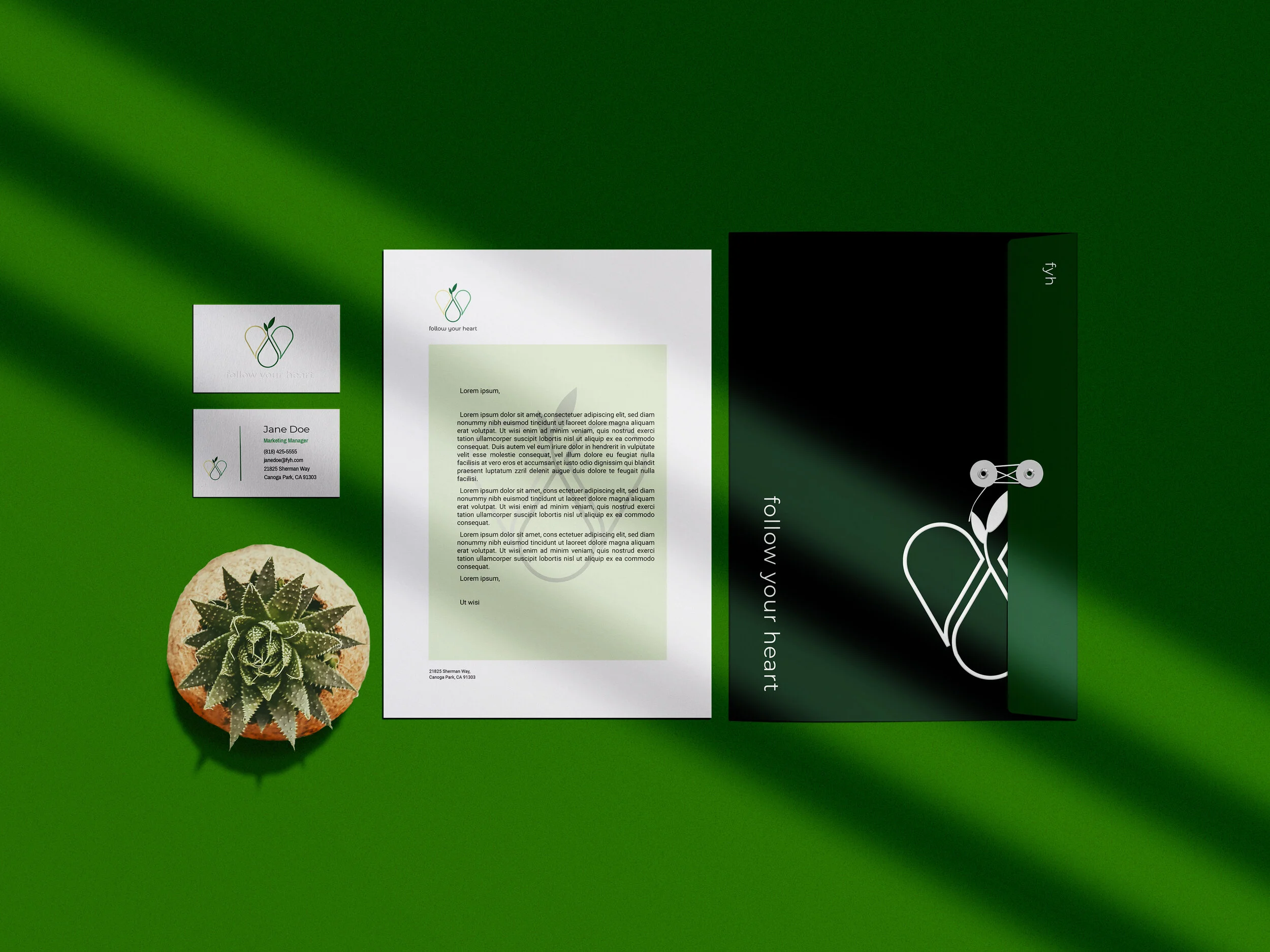
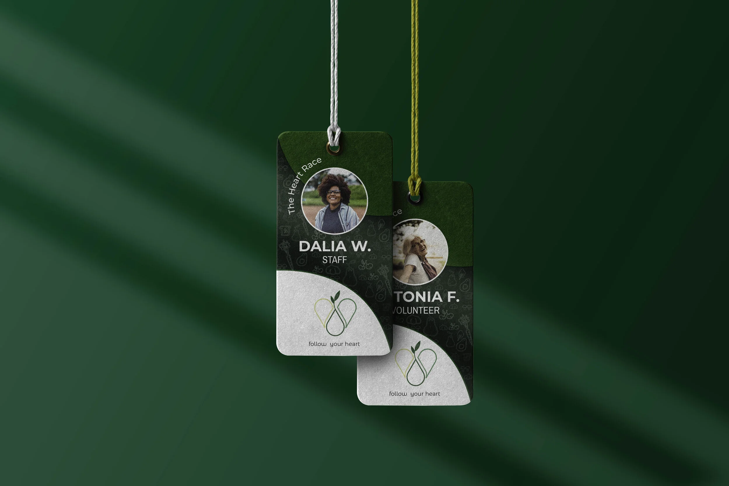
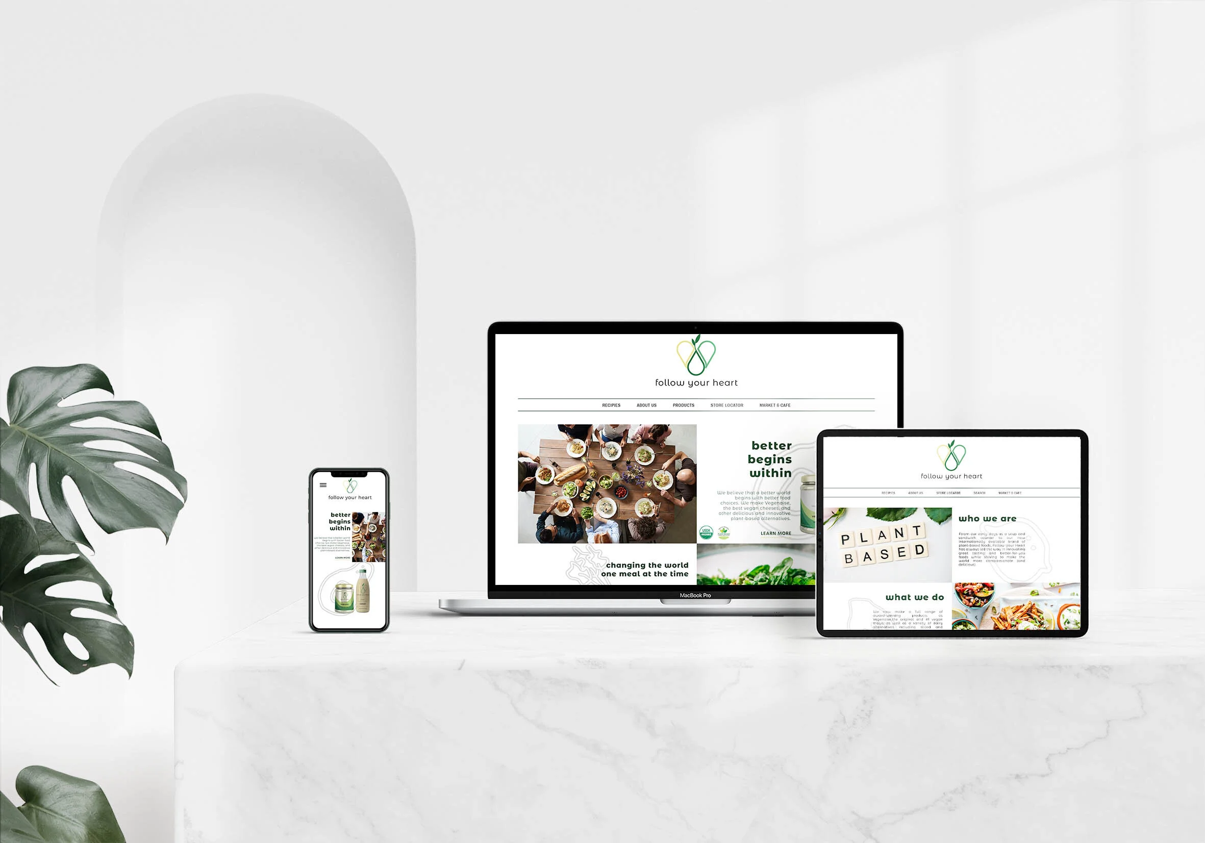
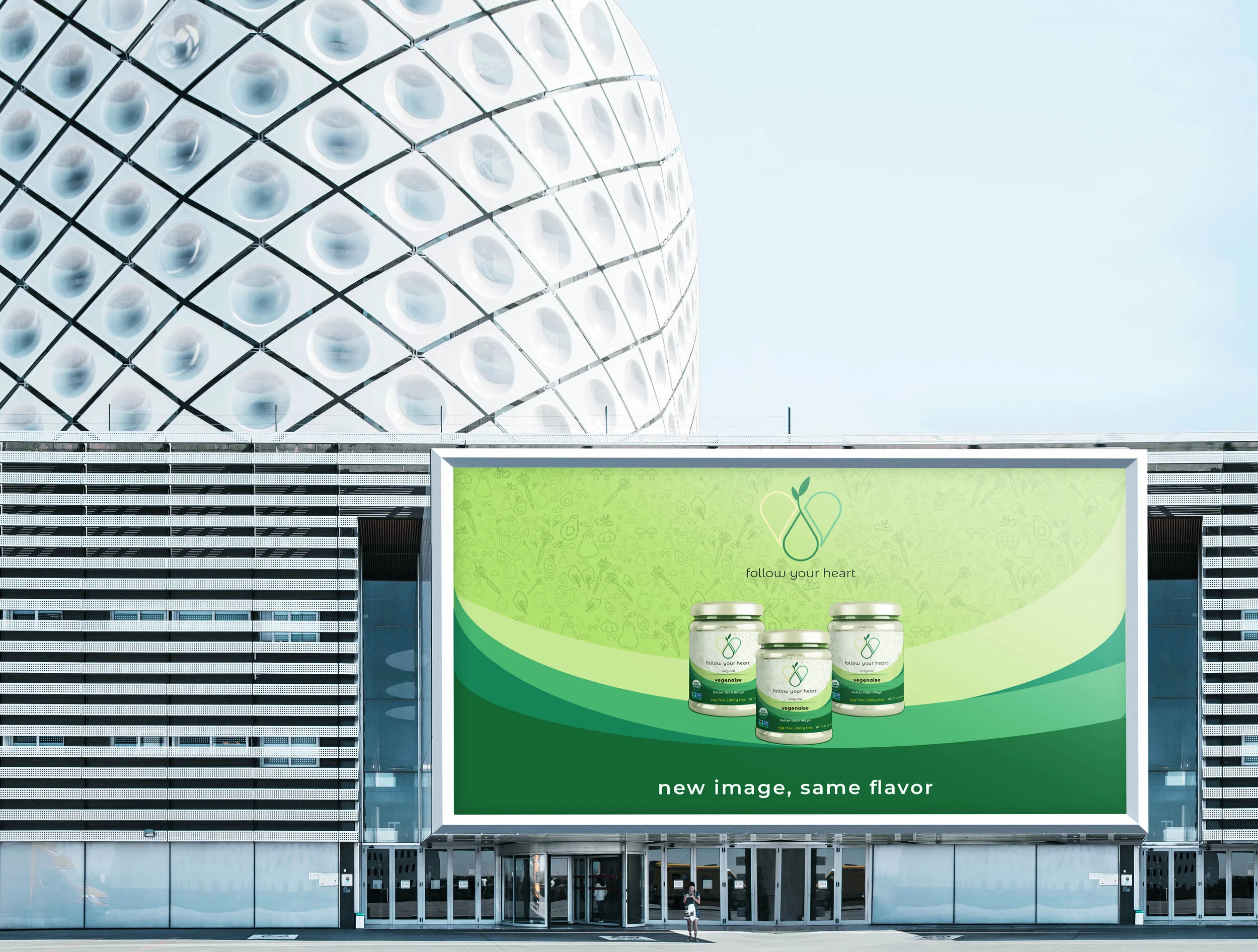
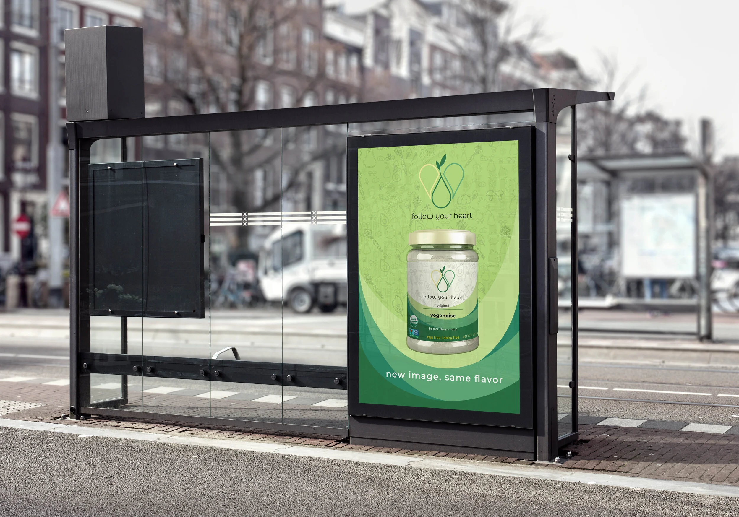
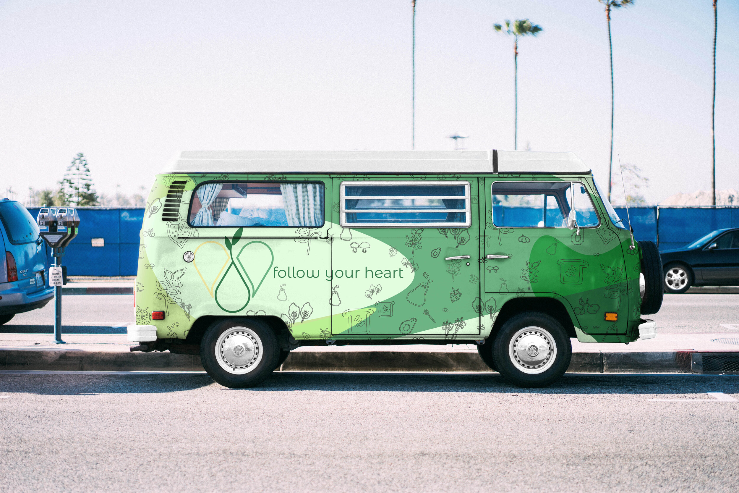
Follow Your Heart
The brand "Follow Your Heart" is built upon core values of compassion, sustainability, and animal welfare. They aim to raise awareness and cultivate empathy in humans towards animals, all while promoting a sustainable lifestyle. This rebranding strategy positions them to attract a wider audience interested in helping the environment, living healthier lives, and caring for the planet's creatures – all under one unified brand.


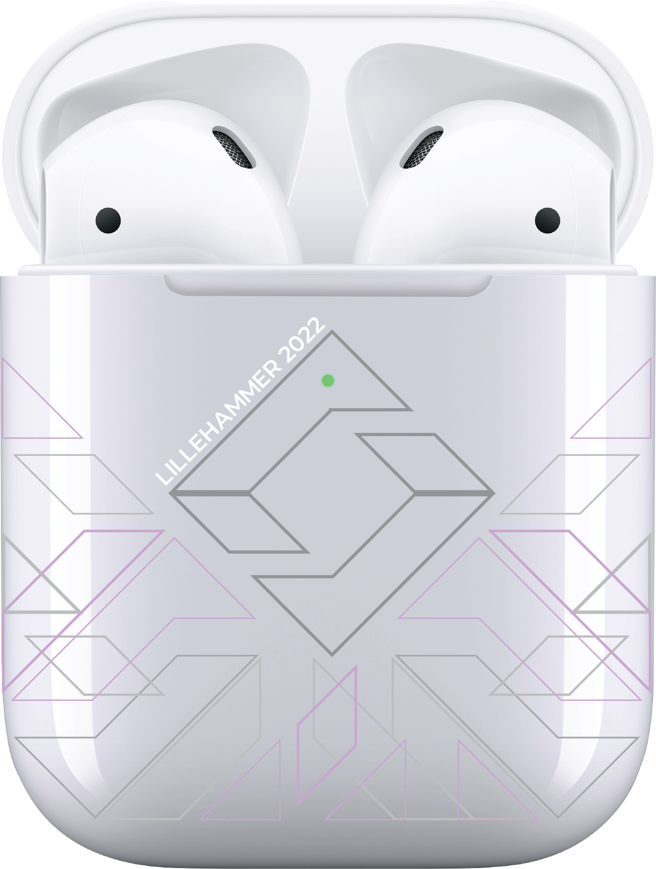
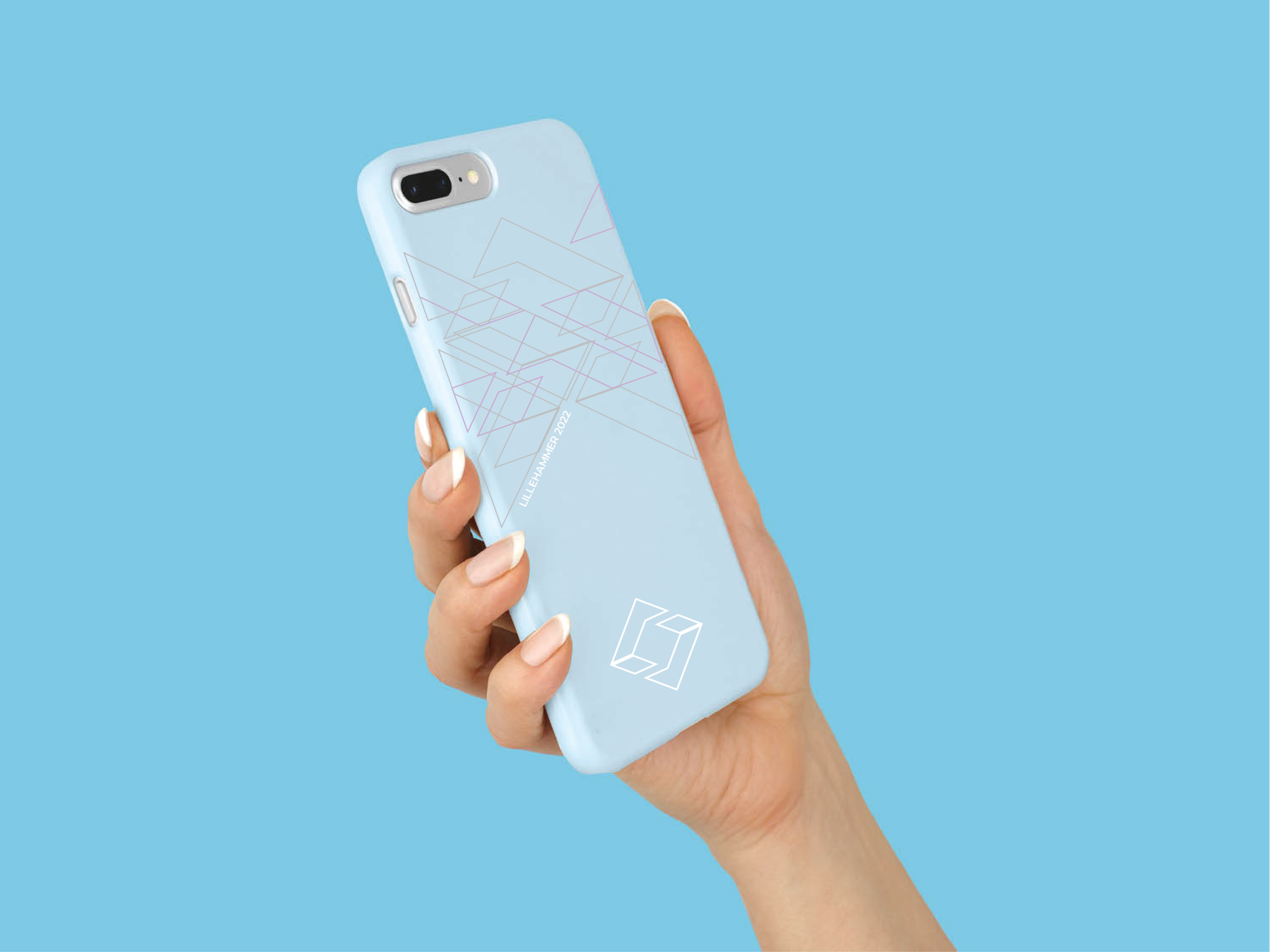
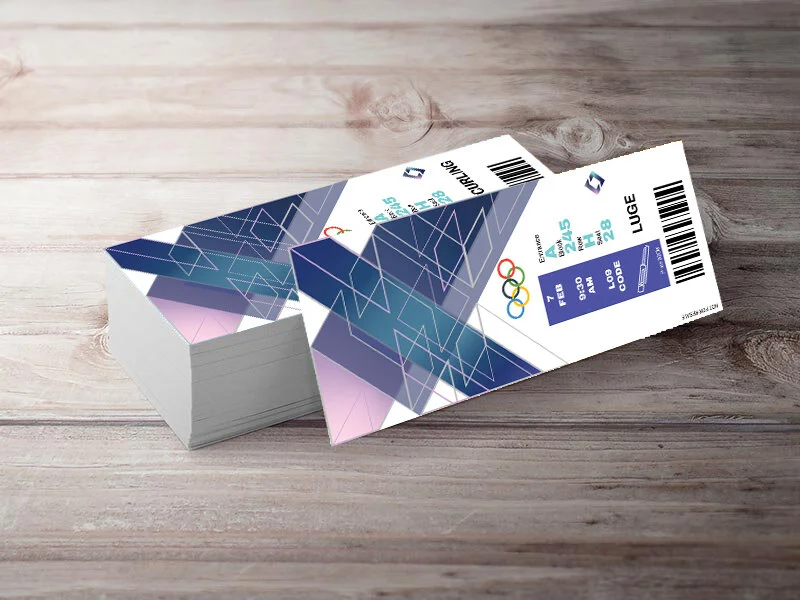
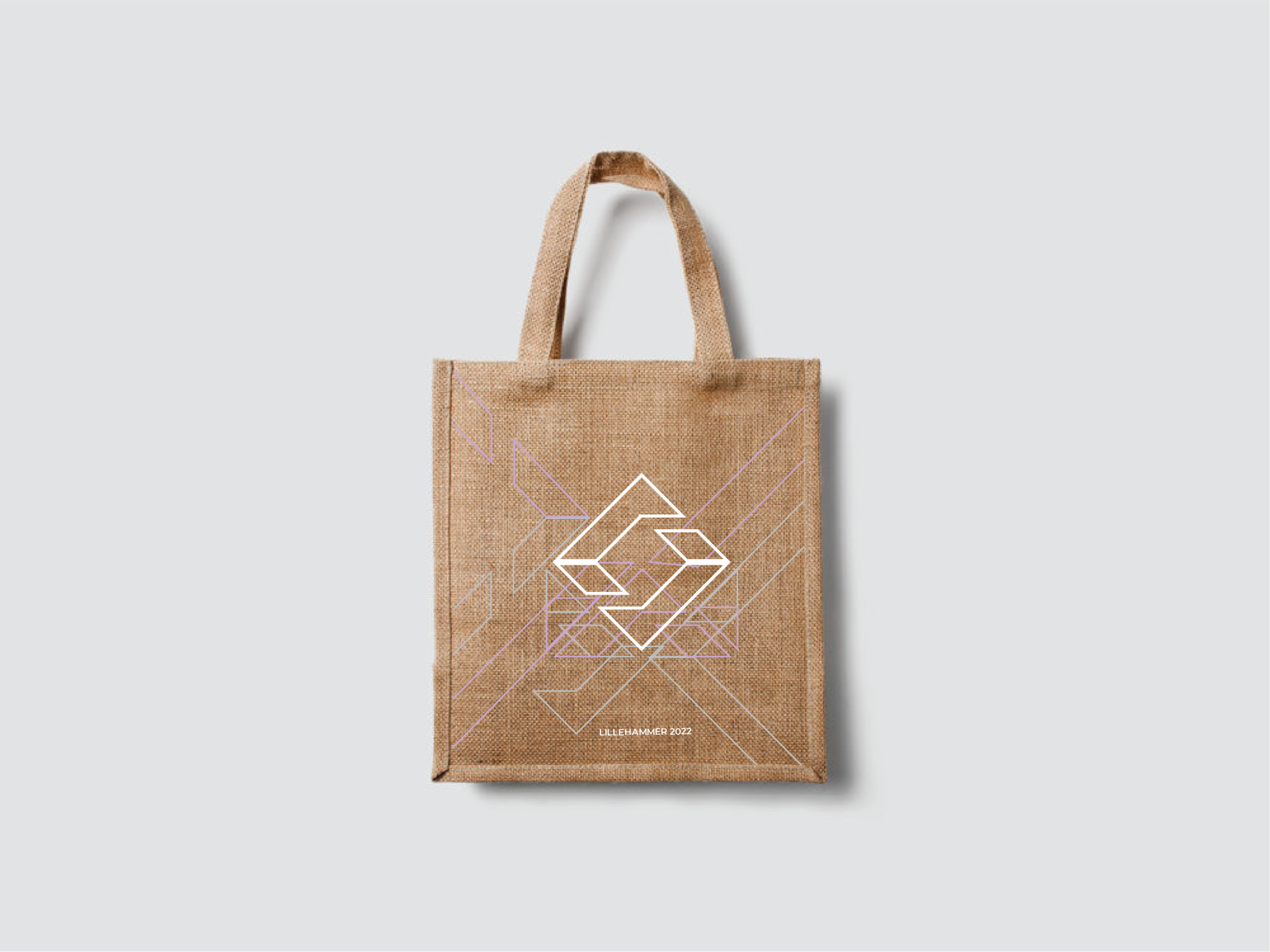
Lillehammer Winter Games 2022
This proposal draws inspiration from the textiles used in creating the traditional Bunad costume. The Bunad, worn by up to 70% of Norwegians, signifies one's geographical affiliation and is a cherished symbol of heritage. Dresses serve a dual purpose: representing heritage and being worn on special occasions like weddings and national holidays. Tradition and culture were the two key elements that sparked this branding project. Capturing the essence of Lillehammer was crucial. The goal was to create branding components that felt natural and connected with locals, while also introducing a sense of newness and inspiration.


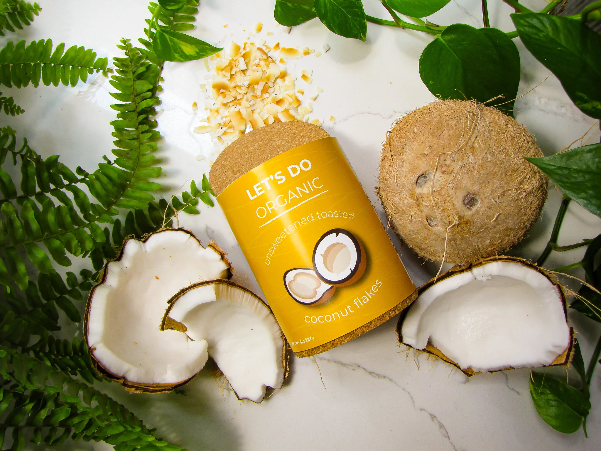
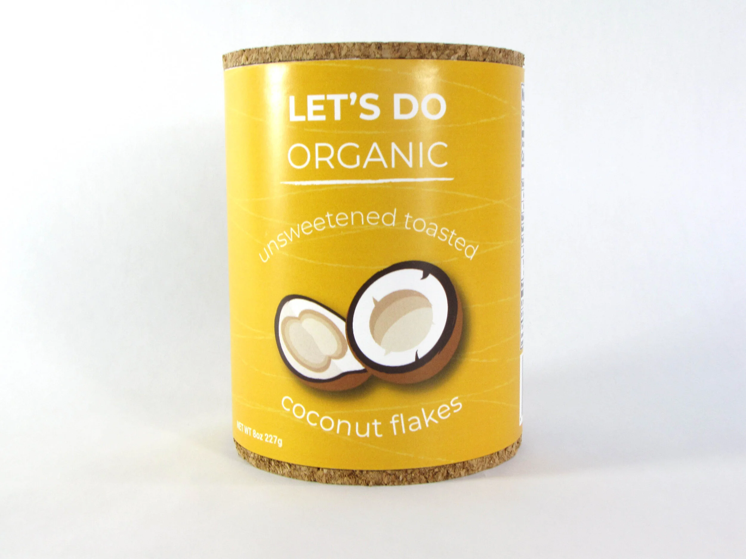
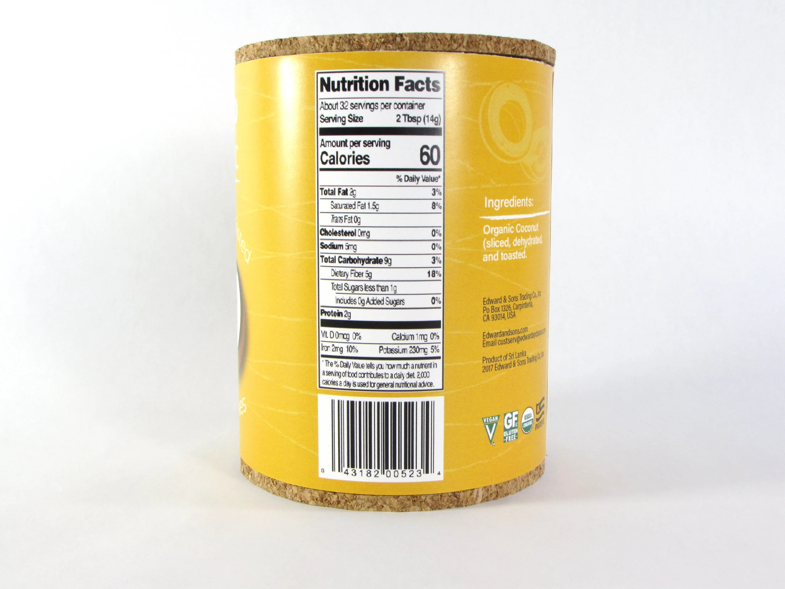
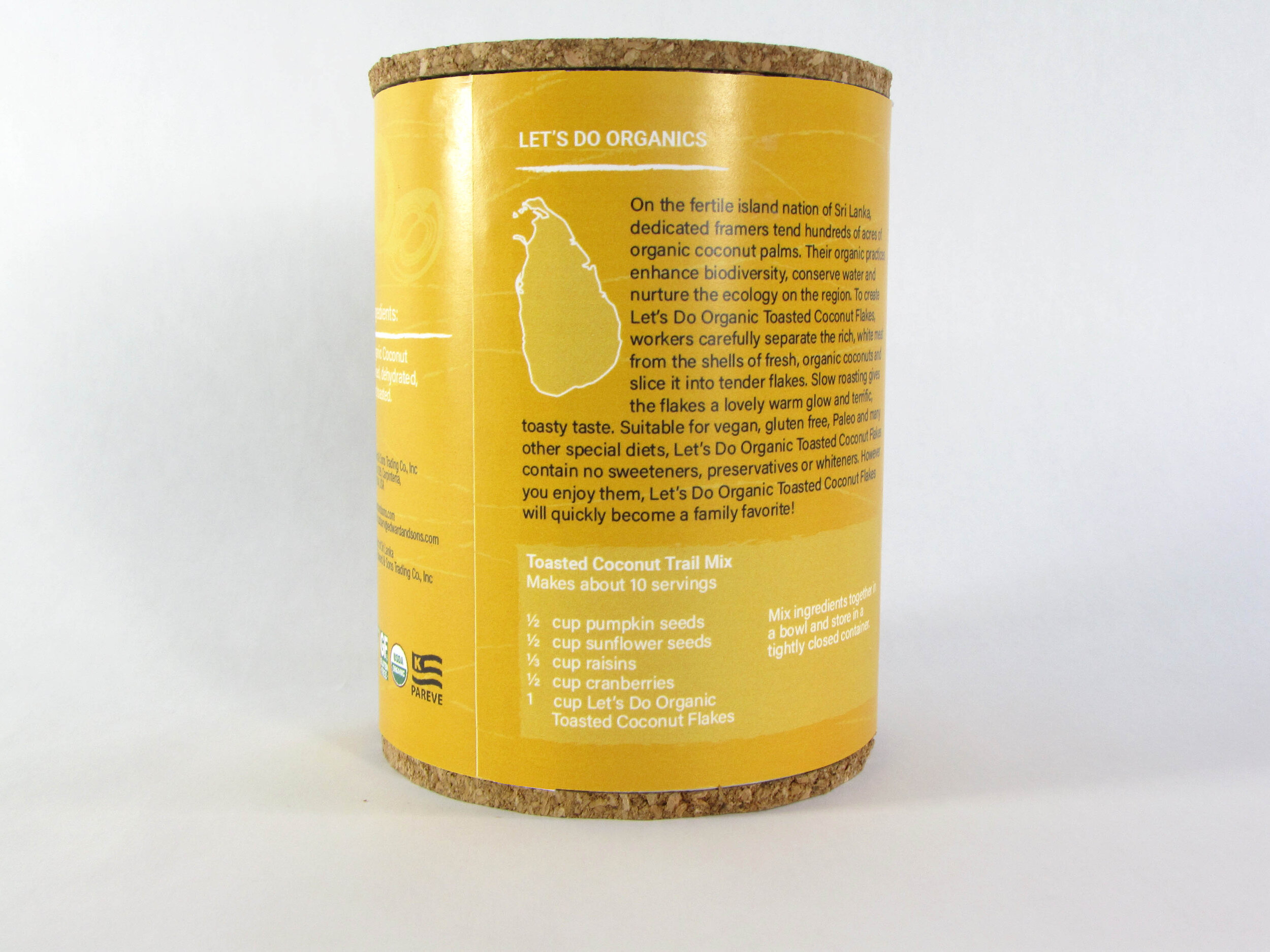
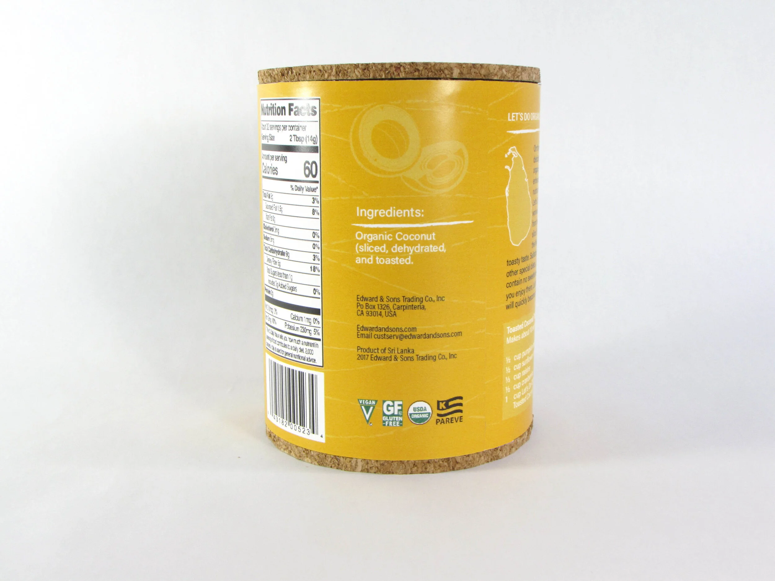
Let’s do organics Coconut Flakes
The goal was to modernize the “Let’s Do Organic” image. The old packaging appeared cluttered and outdated, making it difficult for customers to locate it quickly on grocery store shelves. The design incorporates sustainable materials like cardboard and cork, both of which are easily compostable. As a nutritional product, the fresh look targets health-conscious consumers seeking chemical-free, vegan, kosher, and socially responsible options.